Tables
This site from Seybold makes a convincing argument as to why tables are not a good idea. Check it out. It's a fun site. See what you think of the opinions expressed there.
Generally speaking, what I found argues against using tables for designs, in large part because it's easier to change multiple pages at a time using CSS. There also are some questions about organizing material for best Google results.
I came away convinced that tables are not the way to go for layouts.
Image slicing
It seems like image slicing can be a good option for designing headers and repeating art, but it's not a great idea for an overall site design. There appears to be debate as to whether slicing improves or hurts speed.
This YouTube clip posted by Jan provides a nice, understandable tutorial on how to do image slicing in Photoshop. It makes the process look easy.
I also found a site providing nice step-by-step instructions.
However, I could not try the techniques because the slice option is not available in my Photoshop Elements 6. (Order pending for full Photoshop.)
I'm concerned that text embedded in a photo will not be read by Google. This potentially is a major, major downside to this method.
An alternative
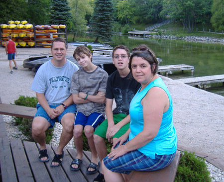
In the meantime, I toyed around with making an image map with a photo (shown below). The benefit is that you can upload a single image and still make sections clickable. In this case, each person's face is clickable. If you're a fan of the TV show "The Office," click the face of the boy wearing a black shirt, and see if you recognize the building in the background.
Here's a tutorial from w3schools.
