A web page about Slicing and Tables that does not use Slicing or Tables
Homework assignment for Tri-C West, Web Publishing: HTML
Summary of slicing and tables
Slicing as I understand it
Slicing and assembling a site with tables means creating an image in Photoshop and cutting it into rectangular parts that are inserted into the grid of a table or into layers in CSS. 3 types of slices:
- User Slices- Slices created with the slice tool
- Layer-based Slices- Slices created from a layer
- Auto Slices- Additional slices automatically generated to account for the remaining area of the image being sliced. (Subslices are a type of auto slice that are automatically created when overlapping slices are made.)
Slicing in Photoshop creates the background code that will be needed for it to render in a browser, and put in a separate HTML folder.
The problems with Slicing
As a sytling mechanism (its a good practice for tabular data) is that search engines won't be able to access the information because it is a picture instead of text. If you use HTML for layout purposes you are writing invalid HTML that won't validate as XHTML. It is time-consuming, expensive work to accomplish if you need to update your web page. Rather than simply retyping the HTML or CSS, you must go back to Photoshop and reconstruct the changes there first. This is complicated by the fact that people who hire designers to do this make changes after the pages have been created and the work may have to be completely redone from scratch.
The Table itself
The table is made up of information- table data <td>, positioned into table rows <tr>. Row after row create a grid-structured table. The table itself is the structure that holds the sliced-up photoshop image with each slice being a single table data element.
Links and descriptions
- Heathrowe
-
 Heathrowe.com's creative solutions page on slicing gives a concise outlay for slicing images in Photoshop to be used in tables presented as a few things to watch out for when using slices.
- Adobe CS4
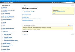
 An Adobe help page for Adobe Photoshop CS4 on slicing web pages with links that give specific information on the aspects of slicing: about slicing, slice types, slice a web page, converting auto and layer-based slices to user slices and view slices and slice option.
- Layers Magazine Tutorial
-
 Gives the steps to slicing from slicing an image in Photoshop, save it, and put it all into Dreamweaver. The craft of slicing is mentioned explaining what to look for by way of natural breaks and diving it into larger areas then dividing those divisions into smaller bits.
- Table Design
-
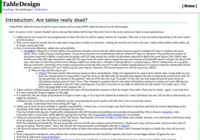
 An annotated compilation of the problems with tables. Although there are listed many reasons why it is bad, some rebuttals have been added to point out the more frivolous points.
- Web design on About.com
-
 An alotment of 7 reasons not to create tables for layout: valid xhtml, tables can be tricky, tables are inflexible, nested tables load more slowly, tables hurt search engine optimization, tables aren't as accessible and tables don't always print well. The moral: learn CSS.
- Westciv.com
-
 Gives a small history of the use of tables as a layout mechanism and how the person who figured it out later regretted it. It was first published in 2001. It then goes into why tables shouldn't be used. Oddly after the part about destroying logical document flow, there are some formatting problems with the page.
- HTMLbutcher
-
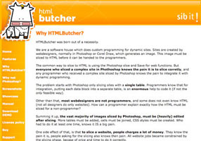
 Web site for a Brazilian software house that discusses some of the problems and draw-backs with slicing in an effort to sell their own product which they see as a superior slicer. They seem to want to sell their product to programmers to avoid having to use designers at all.
You can send me an email if you'd like.