Font:
I am chosing to use Times New Roman for the titles and headers of this site because it looks more elegant and in close relation to the band's font in their logo. I am using Arial for all the normal paragraph text because it is more fun and playful. Not only that it is easy to read.
Colors:
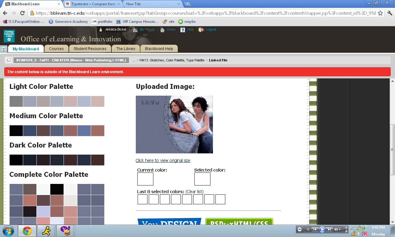
My color palette is based of the background image on this page. I used the program given to use on Blackboard.
Sketch:
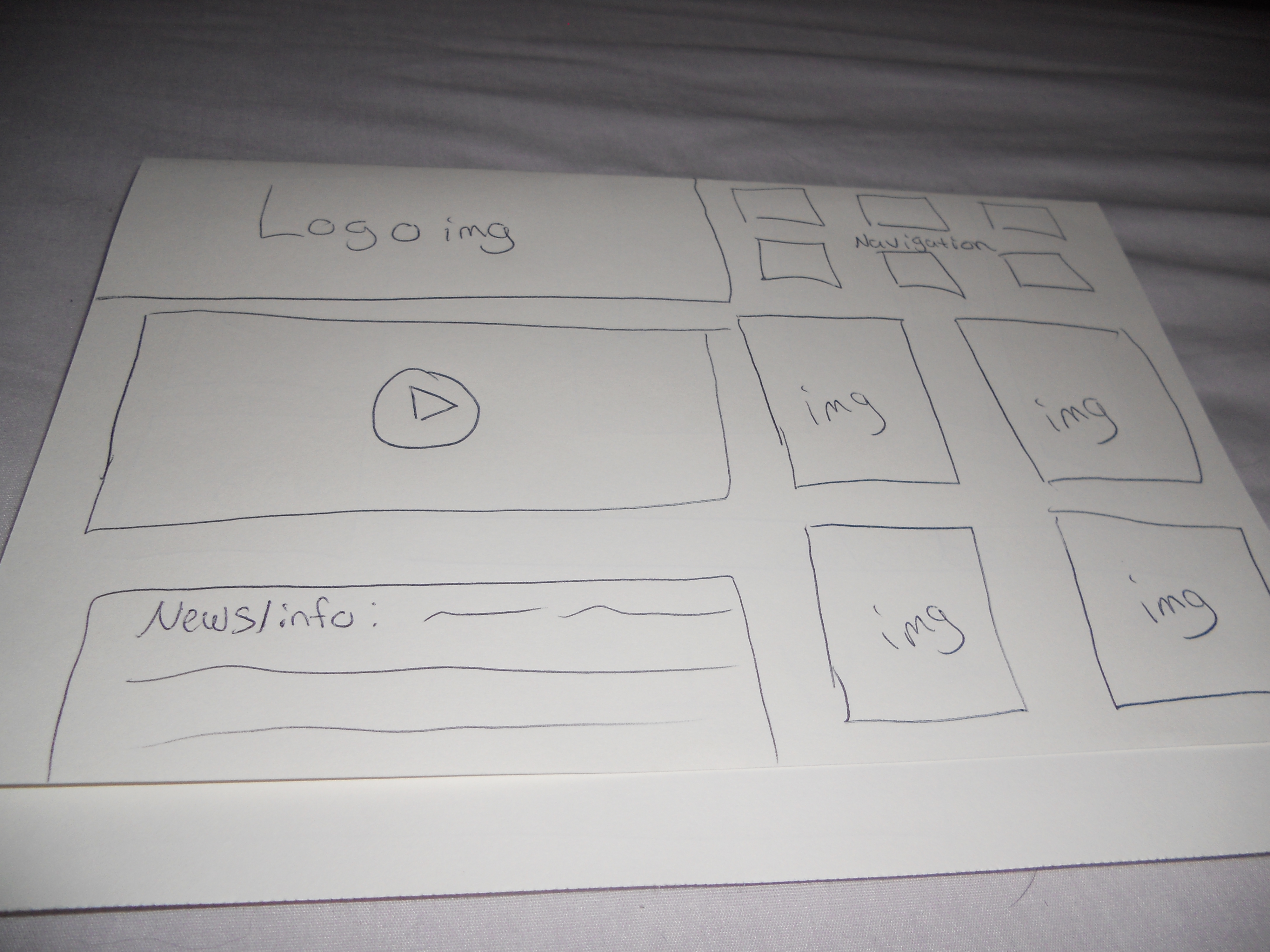
This is the layout of the homepage that I have come up with. It will have their logo in the top left corner, the navigation on the right top corner, a music video, a news feed, and photos of them from shoots or live concerts.


