Color Palettes and Fonts For Music Therapy Site
Palettes
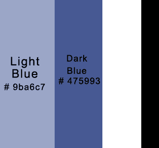
I am torn between a color palette that is calm and soothing, and one that is made of warm earth tones and a little more ‘fun’.
Below are two palettes that I created. The first is calm. The second is earthy and fun.


A Palette Generated from an Image

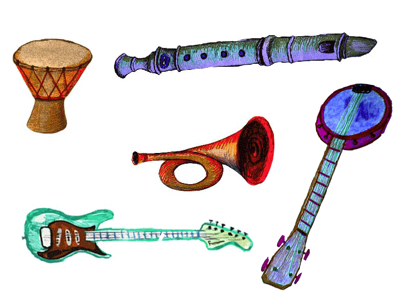
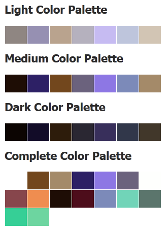
After creating these images for the site with colored pencils and PhotoShop, I decided it might be a good idea to try a palette generated by uploading my image to CSSDrive.com. The palettes below were generated.

If I decide to incorporate these drawings, I will probably use colors from one of the palettes below, or some mix of them. I think the two colors at the far right of the light color palette, combined with the second and third colors from the far left of the dark color palette would provide the ability to create a great deal of contrast. Since I'm allowed five colors, I will add in the purple right in the middle of the medium color palette. These will provide a calm, rather monotone scheme, shown below and to the left.
If I decide to go with something more fun and earthy, I will use the peach color in the complete color palette, to create the warmer, more fun palette shown below and to the right.


Fonts
I would like one ‘music’ font. I think it would be best put to use for sub headings. I would like a more simple but elegant font for headings, and I think that something easy to read like a web safe sans serif font would be best for body text.
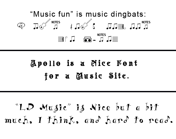
Below are some fonts that I found for free online that have to do with music. It's not easy to find a specialty font, for free, that is easy to read. Apollo isn’t too bad—perhaps it wouldn't make a bad sub header.
The dingbats might come in handy for bullets or borders or background tiles.

On ‘Typetester.org’, I compared three web-safe body content fonts — Verdana, Trebuchet MS, and Georgia — using various font sizes and line-heights. Below I’ve shown samples of the three font-families used as body content in conjunction with Apollo subheaders.
My gut instinct tells me to go with a sans-serif font. Of the two shown, I think Verdana looks nicer than Trebuchet MS. But part of me really wants to break with tradition and go with a serif font for the body content. And my daughter said she thinks the Georgia body content looks better underneath Apollo.
Sample Font Combinations for Sub Headers and Body
Verdana for body content.
Apollo Subheader
Verdana body content, sample text. The quick brown fox jumps over the lazy dog. Foxy parsons quiz and cajole the lovably dim wiki girl. Watch Jeopardy!, Alex Trebek’s fun TV quiz game. How razorback jumping frogs can level six piqued gymnasts! All questions asked by five watched experts amaze the judge.
Georgia for body content.
Apollo Subheader
Georgia body content, sample text. The quick brown fox jumps over the lazy dog. Foxy parsons quiz and cajole the lovably dim wiki girl. Watch Jeopardy!, Alex Trebek’s fun TV quiz game. How razorback jumping frogs can level six piqued gymnasts! All questions asked by five watched experts amaze the judge.
Trebuchet MS for body content.
Apollo Subheader
Trebuchet MS body content, sample text. The quick brown fox jumps over the lazy dog. Foxy parsons quiz and cajole the lovably dim wiki girl. Watch Jeopardy!, Alex Trebek’s fun TV quiz game. How razorback jumping frogs can level six piqued gymnasts! All questions asked by five watched experts amaze the judge.
Tallys, with Apollo caps, for subheader.
Mixed Subheader
Verdana body content, sample text. The quick brown fox jumps over the lazy dog. Foxy parsons quiz and cajole the lovably dim wiki girl. Watch Jeopardy!, Alex Trebek’s fun TV quiz game. How razorback jumping frogs can level six piqued gymnasts! All questions asked by five watched experts amaze the judge.
Conclusions
From what I can see on this site, I am thinking that what might be best for the final site is:
- For a color palette—either the second color palette of the two that I created, or one generated by the cssdrive.com site.
- Tallys font for the page titles. It is the font that is used for the title of this page.
- For the subheaders—A mix of Apollo font for uppercase first letters, and Tallys font for the remainder of the letters.
- Perhaps Apollo font for navigation. If this is hard to read then Apollo caps with Tally.
- Verdana font for body content.