Cheap Live Music
Superlative Cleveland sounds on a shoestring...
Color Palettes
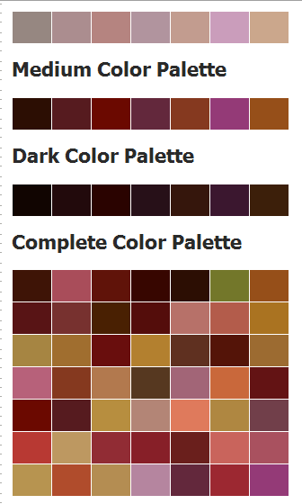
My idea for the color palette of this site is that it should reflect the the common colors of the subject: the black and white of music notation, the ebony and ivory of the keyboards, the brass and silver of horns and woodwinds and cymbals and drums, and the warm wood tones of the strings.
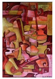
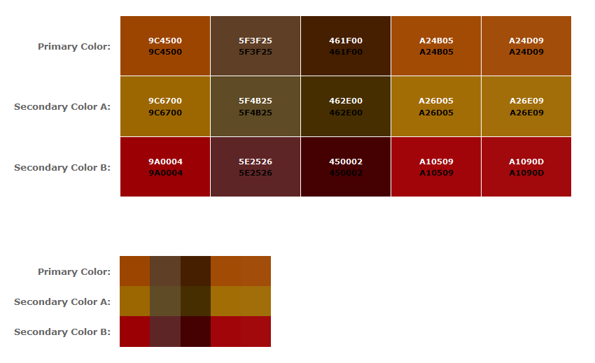
I plan to accomplish this by either using one of my paintings which contains these colors as a background image and drawing on its color palette or choosing one of the other palettes below built around the same basic scheme. I want to keep the colors restrained, using only a few jewel tones to make the site appear richer. I like the irony of presenting high quality and value for free or next to nothing. In other words, cheap and expensive!
These combinations are displayed in order, from the most compex and varied to the simplest.


The Font Palette

I may change my mind, but I'm thinking of doing the headings and subheadings in some variation of Verdana, perhaps some form of UPPERCASE BOLD for the most important lines on the page, and I'll save the more obscure fonts for background and regular foreground images. I opted for title and tagline fonts which appear to be hand-lettered. Any suggestions are welcome. I don't want the site to appear too formal. I'm going for tasteful but accessible.
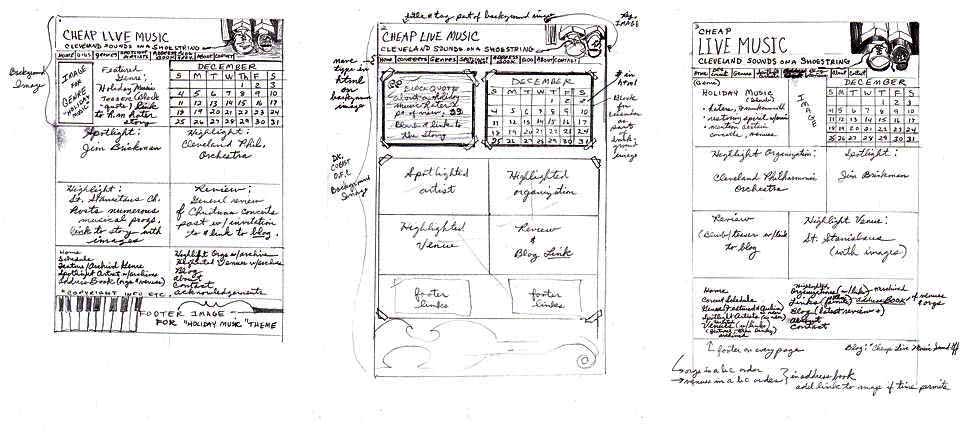
Sketches
