Sketches, Color Palette and Typography for the Jim Morrison Website
Sketches
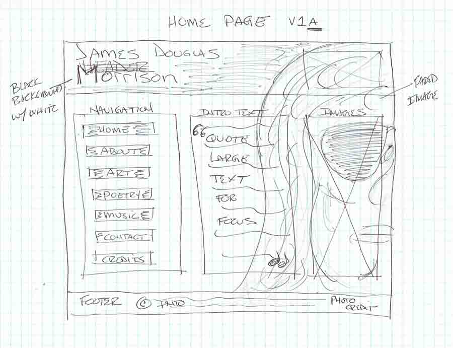
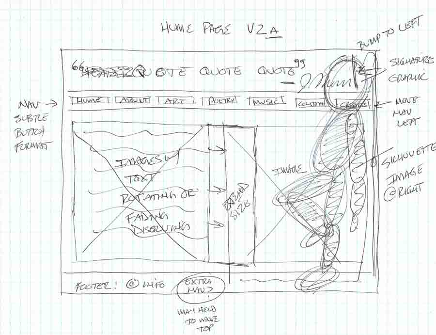
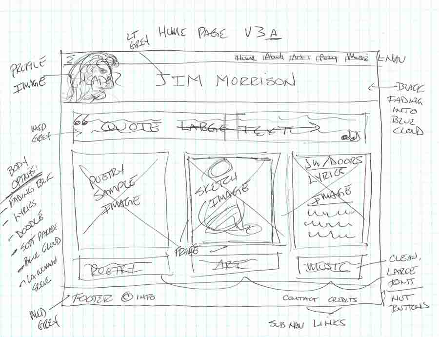
This week we are building upon our wireframes from Week 12. Below are a series of sketches that provide ideas for the overall look and feel of my final project homepage. Ideas for the Color Palette and Typography follow below.
Color Palette
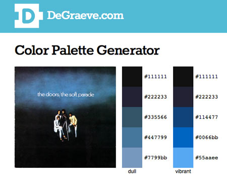
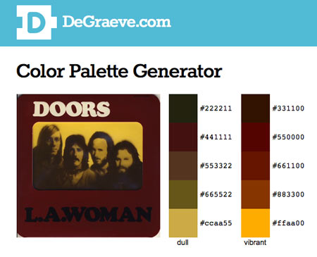
Color helps to communicate the tone or feeling of the website. I have chosen two palettes based on album artwork. Blues and blacks set a more somber mood or burgundy and gold for a more earthy feel. I intend to primarily use black and white with a few accents.
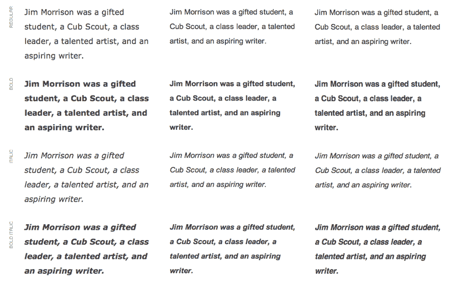
Typography
Typography is another important element of website design. The type must be easy to read, but can also be used to communicate tone and feeling. In this case, I am most concerned with readability and having a clean look. I will be using a font stack of Helvetica, Verdana, and Arial for the body and either Trebuchet MS or Arial Narrow for the headings. I am still thinking about using a different font in a header graphic.

