Good Navigation
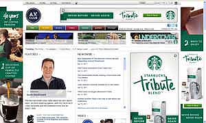
AV Club
This site is a little cluttered, but has a clickable logo
on the left and consistent navigation from page to page.
The navigation tabs are also nicely distinguished.

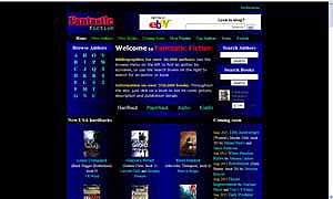
Fantastic Fiction
This site also has a clickable logo on the left,
consistent navigation from page to page,
and a clear search field on the right.

Bad Navigation
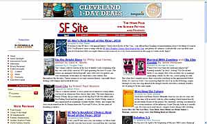
SF Site
This site's not too bad, but doesn't really take advantage
of familiar conventions. The logo isn't clickable to home page,
the nav bar doesn't stay consistent between pages,
and rather than provide a convenient search bar you first
have to click on a search button.

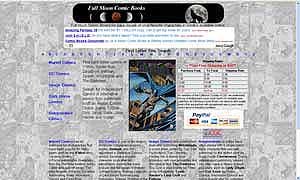
Full Moon Comic Books
This site does not have a clickable logo,
is visually hard to make out, and the navigation
is also hard to spot.
