| |
49 Tips for Better Websites- Part 2 of 3
We started
this series with Writing for the
Web, Visual Design, and
Color.
This month we're
covering Type and Graphics,
and we'll finish up next month with Domains & Hosting and Promotion.
These are only
my opinions, based in experience and lots of research. Many were learned
the hard way. But they're still only opinions. As always I welcome your
comments and additions or deletions to these lists.
|
Learn
more about web design:
Online tutorials
Recommended books
|
|
| |
Typography
- Keep it simple! Use
no more than 2-3 different typefaces (fonts) for your entire site.
- Keep it consistent:
pick a particular font & size for headlines, subheads, main text,
etc., and stick to it.
- Typefaces have personalities: choose what's appropriate
for your material.
- Make type large enough
to read easily: users
prefer 10 to 14 pt. type for main copy.
- Italics and
bold become difficult to read after a
few sentences: use them sparingly
- Use ALL CAPS only for emphasis, headlines, etc.
As above, they are hard to read in quantity.
- Contrast can be effective: Use bold or fancy
headlines with normal text, etc.
- Don't use a script
or italic font in all caps: it's very hard to read.
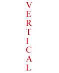
- Don't set type vertically:
it's nearly impossible to read (we're used to reading left to right).
Agree? Disagree? Email me
your comments. See also links
on typography on the web.
|
All caps are a no-no with script or italic!

Likewise, running the letters vertically:
|
|
| |
Graphics
- File size is critical:
a 50k graphic takes about 10 sec. to download on a 56k modem.
- Low resolution is
the name of the game: 72 ppi is all you need.
- Less is more: a few
well-chosen
graphics reduce visual clutter and speed download.
- Re-use the same graphic
in different places to save download time.
- Use GIF for typography
and flat, cartoon-y artwork.
- Use JPEG (JPG) for photographs
and art with subtle color blends.
- For large images, use a small "thumbnail"
to link to the image on another page.
- Use "interlaced" or "progressive
download" format so large images show up
in stages as they download.
- Create simple backgrounds
by "tiling" a small image: be careful to not overpower the
text.
- Avoid web "clichés":
spinning logos, 3-D buttons, blinking text, rainbow effects.
Yes? No?
Email me your comments.
|
Return
to TOP |
|