|
|
||||||||
|
<--[Swiss Quiz] |
 |
|||||||
|
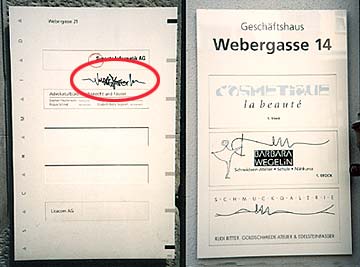
The graffiti (circled in red above) looks right at home because it follows the same design principle (Contrast) used in the bottom two logos on the sign at right. |
Both signs use a rectangular grid, typical of Swiss design. The uniformity of the grid and the sans-serif type create an irresistible background for a vigorous, organic accent line. |
|
||||||
|
|
[HOME] | [About this site] | [Email]
|
|||||||