FEBRUARY 11, 2009
Herron School of Art
 It's good to be back in Indianapolis—brings back memories of the three years I taught here after grad school. I had coffee with Paula, my former boss and the person who met me the first time I stepped off a plane at the Indianapolis airport in 1996.
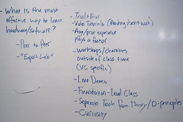
But I'm here to learn about how people view design education and today I got a different perspective. In the past several months I've talked with more than a dozen teachers in a half dozen cities about their approach to teaching design and teaching software. Today I heard from students at Herron School of Art. I started with a group of enthusiastic sophomores who quickly listed what that they liked and disliked (you can see one group's notes at right).
Later I spent over an hour with a senior talking one on one about his view of how he's been taught. The Herron faculty would have been happy to hear that he's very enthusiastic about their emphasis on "big picture" design thinking, a relatively new trend in design education. This student was happy to learn software on his own, and confident that he could do this whenever necessary. Both he and most of the sophomores I talked with earlier wanted to spend class time learning design principles.
I'm certainly not going to argue about the value of high-level thought about design: research, planning, evaluating, concepting. This is how you move beyond mere decoration and making things look pretty to creating design that effectively and efficiently solves real design problems. But...
...designers make stuff, whether it's printed posters, environmental graphics or websites. To make stuff you need to master the tools and techniques that are intrinsic to the work itself. I worry that by focusing on design thinking and pushing the mechanics (how to use software effectively) to video tutorials and trial and error individual learning we're short-changing our students. In a sense we're cherry-picking the work: teaching the most interesting part and leaving the students to learn the mundane but critical craft-related skills on their own. Some students readily learn in this way, others struggle greatly. Those who learn to complete projects more or less successfully may never learn the most elegant and effective way to do it, something we teachers may have learned through years of practice.
A significant and unsettling piece to the discussion: students like video tutorials and dislike reading books. Yet in my survey of what learning sources their teachers recommended/required, books are by far the most=required (because teachers learn from books). This suggests significant differences in our approaches to teaching and learning.
More on this another time.
 Moule Frites
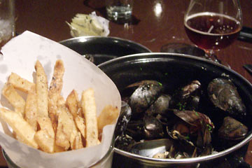
One thing that Joanne and I came to love when visiting France was "Moule Frites," —mussels and what we call French fries. In France "moule frites" is the equivalent of the burger and fries in the U.S. Every restaurant seemed to have a moule frites lunch special, and they were great.
So I was happy to see moule frites on the menu at Brugge, a Belgian-influenced restaurant that Paula, her husband Bruce, and I dined at tonight.
It was all good, from the peppery fries to the strong Belgian beer. We cleaned up our two pounds of mussels and small container of fries in no time, then followed with a Nutella crepe for dessert. Yum.
Balloons... wow!

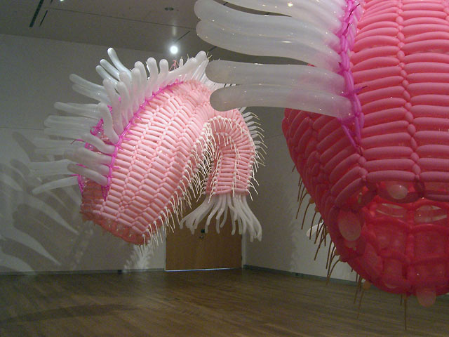
The main gallery at Herron was dominated by huge fish-like sculptures made of skinny balloons, similar to those wielded by the "balloon guy" at your grandkid's birthday party.
This installation by Jason Hackenwerth says "Art" in a big way. The most mundane of objects, rubber toy balloons, were transformed by the artist into giant magical fish shapes. But these fish were big, about 8 by 20 feet. They were gorgeous, dominating the gallery space in a vaguely sinister way. Yet any threat they posed was undercut by the familiar rubber balloon smell that filled the gallery.
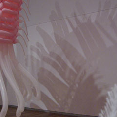
 The balloons themselves were impressive enough, but there was another aspecit to the installation. Artfully arranged lights cast multiple shadows onto the gallery walls and floor, adding layers of complexity to the scene.
Top |
|
![]()