 The
old answering machine crapped out recently, and when we went to buy a new
one we found that these days an answering machine comes with a phone. OK,
fair enough. The price is about the same anyway, and we get a new phone to
boot. And the answering machine, all digital, of course. No more of those
tiny tape cassettes.
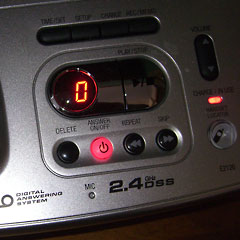
After living with our shiny silver 2.4 GHz DSS Digital Answering System for several weeks now, we've noticed that we often forget to turn it on. Like the week we went to New Hampshire. Have we gotten more forgetful with the start of a new year?
Possibly, but there's another problem. As you can see in the picture, the machine's Power On light is red. But in our culture, red usually indicates off, green is on. So the machine is sending mixed messages, confusing us about it's current state. And the other two red lights that are always on make things worse. When you glance at the phone you always see red lights. It always looks like it's on, even when it's off.
 A
simple change in the user interface would make things better. Changing the
color of the light couldn't add a great deal to the manufacturing cost, yet
would make the product considerably usable. Didn't this occur to anyone?
What's your favorite crappy user interface example?
District of Design
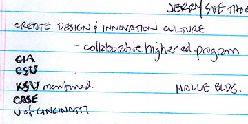
A pretty impressive group of individuals and organizations is working to create an area in Cleveland where design firms and related industries will concentrate, to create a critical mass. I attended a meeting today at CSU where plans were outlined, and came away fairly optimistic that this might be one of those ideas that actually does see the light of day.
 I
was dismayed that quite a few colleges were mentioned as being involved,
even some outside of Cleveland, but not Tri-C.
It took me a bit of time to work up the courage to ask my question of the panel, but I finally headed to the mic and said "I'm dismayed that Tri-C isn't represented here."
The response was that the organizers had just had a 2-1/2 hour meeting with Jerry Sue Thornton (Tri-C president) and others, and that they are "on board." I think it may be time for me to email my ideas to Jerry Sue herself. The way the college works is very top down, so I guess I'd better try getting to the top.
My other concern is that the planners seem to be pretty much disregarding a respectable number of web design firms that are already located in the target area. My proposal is for Tri-C to create a "post-graduate" web design studio in the District where our best student can learn and intern with area companies.
MORE:
Design District Progress Report courtesy of CSU.