Resources Page
Books on Typography
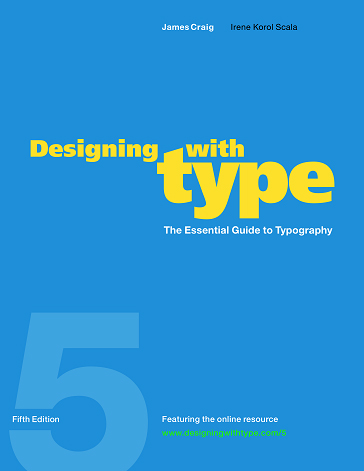
Designing With Type. Part textbook and part reference work, the fifth edition of a typographic classic begins with a thumbnail history of the development of written language and ends with a glossary; in between are in-depth looks at five classic typefaces, lessons on designing with text type, display type and color, and plenty of project assignments.
Though Craig, the former design director for Watson-Guptill, touches on the way that type design can be akin to fine art, most of his focus is on the subtle ways in which typeface affects "mood," and letter shape and spacing influences readability, emphasis and even meaning. Even though technological advances have made innovative text design ever simpler, readers of books, brochures, cereal boxes and subway advertisements still tend to prefer their type to be "invisible" in other words, "to serve as a quiet vehicle for enhancing the meaning of a text."
While best suited for a beginning graphic design student, this clear, readable book should also intrigue those interested in how the look of a sentence has an impact on the way we read it. Click here to get this book on amazon
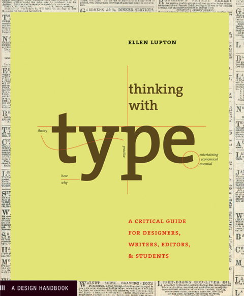
Thinking With Type. Ellen Lupton is one of America's preeminent design educators. Her books include Skin, Inside Design Now, and Mixing Messages, among others. She is currently director of the design program at Maryland Institute of Art and Design.
The organization of letters on a blank sheet -- or screen -- is the most basic challenge facing anyone who practices design. What type of font to use? How big? How should those letters, words, and paragraphs be aligned, spaced, ordered, shaped, and otherwise manipulated? In this groundbreaking new primer, leading design educator and historian Ellen Lupton provides clear and concise guidance for anyone learning or brushing up on their typographic skills.
Thinking with Type is divided into three sections: letter, text, and grid. Each section begins with an easy-to-grasp essay that reviews historical, technological, and theoretical concepts, and is then followed by a set of practical exercises that bring the material covered to life. Sections conclude with examples of work by leading practitioners that demonstrate creative possibilities (along with some classic no-no's to avoid). Click here to get this book on amazon
Websites
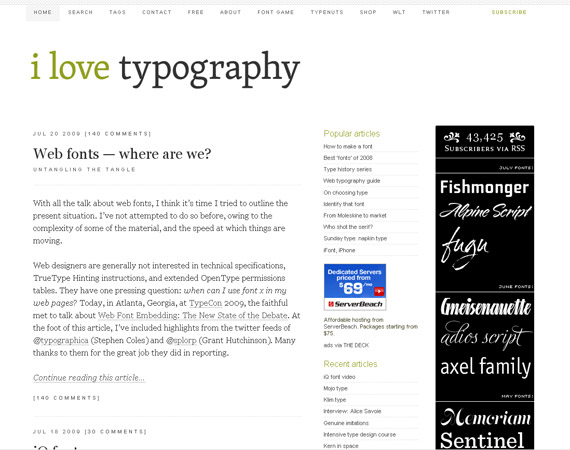
ILoveTypography. This blog is focused and devoted towards anything and everything that is Typography, type, fonts, and typefaces.
So, ILT is designed to inspire its readers, to make people more aware of the typography that's around them. We really cannot escape type; it's everywhere: on road signs, shampoo bottles, toothpaste, and even on billboard posters, in books and magazines, online the list is endless, and the possibilities equally so. Visit the site.
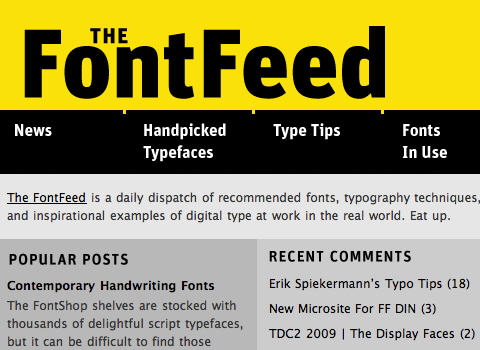
FontFeed. On a daily basis FontFeed finds recommended fonts, typographic techniques, and digital type at work in the real world for real life examples on how to put typography in use.
In early 2008 type designer and FontShop co-founder Erik Spiekermann reimagined the FontFeed as a stand-alone blog dedicated to typography and it officially launched in its new space on 9 September, 2008. The FontFeed once existed in a different form at FontShop.com with posts by Stephen Coles, but now combines the insightful voices of prominent design writer Jurgen Siebert and typogoraphy expert Yves Peters, with occasional contributions from Herr Spiekermann himself. Read more about the new FontFeed. Visit the site.
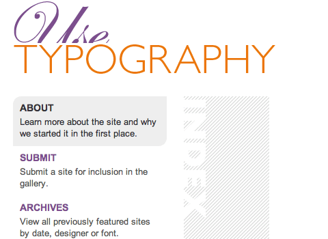
UseTypograhy. Use Typography is mainly focused on showcasing websites that have good typography. Its purpose is to inspire and encourage good typography principles in web design. Visit the site.