Line and Character Spacing
Many people, designers included, think that typography consists of only selecting a typeface, choosing a font size and whether it should be regular or bold. For most people it ends there. But there is much more to achieving good typography and it's in the details that designers often neglect.
These details give the designer total control, allowing them to create beautiful and consistent typography in their designs. Here you will learn what kerning, tracking and leading are all about.
Kerning
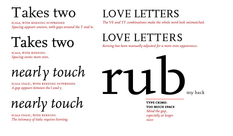 The term kerning refers to adjusting the space between two letters. If letters in a typeface are spaced too uniformly, they make a pattern that doesn't look uniform enough. Gaps occur, for example, around letters whose forms angle outward or frame an open space (W, Y, V, T, L).
In metal type, a kerned letter extends past the lead slug that supports it, allowing two letters to sit more closely together. In the digital typefaces used today, the space between letters is controlled by a table of kerning pairs, which specify spaces between different letter combinations.
Tracking
![]() Adjusting the spacing across a word, line, or column of text is called tracking, also known as letterspacing. It is common practice to letterspace capitals and small capitals, which appear more regal when standing apart. By slightly expanding the tracking across a body of text, the designer can create a more airy field. Negative tracking is rarely desirable. This device should be used sparingly, to adjust one or more lines of justified type.
Adjusting the spacing across a word, line, or column of text is called tracking, also known as letterspacing. It is common practice to letterspace capitals and small capitals, which appear more regal when standing apart. By slightly expanding the tracking across a body of text, the designer can create a more airy field. Negative tracking is rarely desirable. This device should be used sparingly, to adjust one or more lines of justified type.
Leading
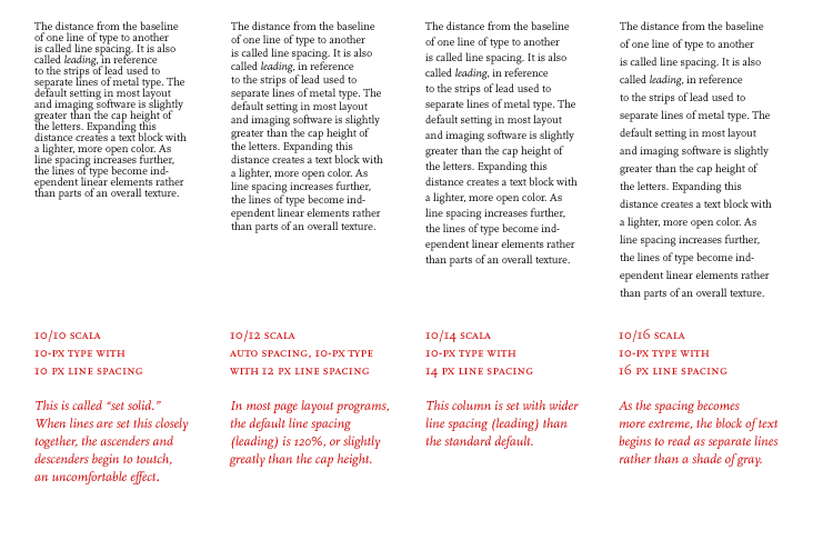 The point system, used to measure the height of a letter as well as the space between lines ( leading ), is the standard measurement for type. One point equals 1/72 inch or .35 millimeters. Twelve points equal one pica , the unit commonly used to measure column widths.
Typography also can be measured in inches, millimeters, or pixels. (A point is roughly equivalent to a pixel.) Most software applications let the designer choose a preferred unit of measure; picas and points are a standard default.
The point system, used to measure the height of a letter as well as the space between lines ( leading ), is the standard measurement for type. One point equals 1/72 inch or .35 millimeters. Twelve points equal one pica , the unit commonly used to measure column widths.
Typography also can be measured in inches, millimeters, or pixels. (A point is roughly equivalent to a pixel.) Most software applications let the designer choose a preferred unit of measure; picas and points are a standard default.
The horizontal dimension of a letter is its set width . The set width is the body of the letter plus a sliver of space that protects it from other letters. The width of a letter is intrinsic to the proportion of the typeface. Some typefaces have a narrow set width, and some have a wide one. You can change the set width of a letter by fiddling with its horizontal or vertical scale. This distorts the proportion of the typeface, forcing heavy elements to become thin, and thin elements to become thick. Instead of torturing a letterform, choose a typeface with the proportions you need, such as condensed, compressed, or extended. Type families such as Helvetica, Univers, and Interstate include a variety of widths.
Source Thinking with Type