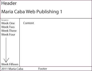
The first wireframe is how my page looks now.

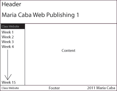
This second wireframe has a slight change. There will be a link that will go back to the class homepage.

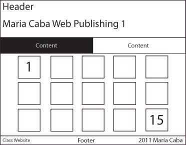
The third wireframe is how I would like my home page to be. The navigation will be a grid. Each square is "card" that will be designed. When you click on one of the numbers, the card will flip showing how that weeks assignment looks. Then if you would like to see even more on how that site looks, you click again which will open up a new window with that site.
