 Sign
of Spring
The pink blossoms and leaves unfurling behind the fence on the Case Western Reserve University campus were a welcome sight. It was damp, gray and misty spring day and these bushes were literally bursting into color. At other spots around the campus, tulips were blooming, too.
I was walking to the University Circle Arabica after visiting the Thesis Exhibition of students in the MFA Program in Digital Arts at CIA (Cleveland Institute of Art). The work was mildly interesting but by and large nothing new.
Much of what's called Interactive Media tends to be fairly primitive: work that resemble print but is displayed on computers. What else it can be is still evolving, and this is what you hope to see from grad students.
Coincidentally I later got a Google Alert about a similar Interactive Media thesis show at USC. From reading the papers online it seems that these students are pushing the boundaries more. Wish I could get to LA for this.
TOP
Towpath Trail heads north...eventually
 You
may know from previous posts that
I'm a big fan of the Towpath
Trail that
runs along the Cuyahoga River and Ohio-Erie Canal. I was happy to see a good
article on
how it will be
extended
north from its current trailhead at Harvard Avenue.
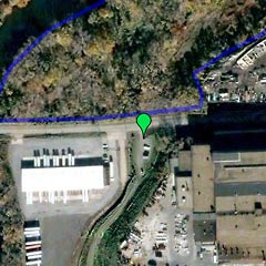
I didn't think the map with the article gave a good enough picture of the
area, so made my own Google map of the northernmost
point on
the trail.
At right, the green marker is the parking lot/trailhead in the shadow of the huge ALCOA plant. The blue line shows where the next phase of development will take place. The Cuyahoga River is in the top left corner.
The discouraging point made in the article is that, due to federal regulations on how projects like this are completed, there's a whole lot of study and planning that has to be done. Construction won't begin until 2010 at the earliest.
For more information on the environment, sustainability, and a whole range of sustainability issues for our region, see GreenCityBlueLake.org.
TOP
 Designers Toolbox
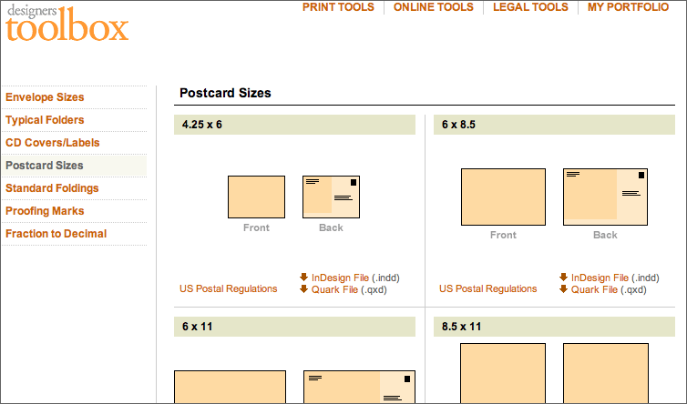
It may not be the only or even the best of its kind, but the Designers Toolbox site still is worth bookmarking. I found the clear specs and templates on postcard sizes very useful, having just been through a search for this info with the Portfolio Preparation class. There are similar sections for envelope sizes, folders, CD labels, etc.
Online Tools include reference tables listing web banner ad sizes, HTML code for special characters like the copyright mark, and graphics you can use to mock up a website form, like Mac OSX radio buttons, Windows scroll bars, etc.
Less useful, in my opinion, is the CSS Generator that lets you pick a font, size, leading, color, etc. and then generates the CSS code for you. The result is the "dumbed down" way of using CSS that WYSIWYG editors like Dreamweaver use: it creates a new class for every style.
Instead of this very limited and clunky approach, why not teach yourself CSS? It's not that hard.
No, really, especially if you're simply using it to style the type. Try the tutorials at w3schools.com and I think you'll find it's both simpler and far more powerful than the CSS Generator would have you believe.
TOP
ARCHIVE
- Student portfolio review
- Dad's birthday
- Red {an orchestra}
- Web 2.0 successes
- Car tattoos
- Great brunch
- TED Talks
- Poor infographic
- Silverlight vs. Flash
- Recycle + exercise
- Better designer tips
- Our Town, CPT
- Audio news
- Old Ford
- Sound of ideas
- Nashville trip
- Dream house
- Soccer in the suburbs
- Hospital story
- Fragments
- Mixed message
- Multiculturalism at Tri-C
- Pretzels
- SEO Pyramid
- Spam, monkeys, Shakespeare
- Sebastien Chevrel
- Spring blossoms
- Towpath Trail
- Designers Toolbox