MARCH 11, 2009
You know your $35 million rebranding sucks when...

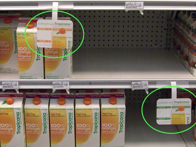
...grocery stores need to add little signs to their cooler shelves so customers can find the orange juice they are already used to buying.
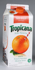
PepsiCo, the folks that decided they liked the Obama logo so much they used it for their caffeine and high fructose corn sweetener beverage, have done it again. They paid Arnell Group a boatload of money to defy common sense and try to fix what wasn't broken.
Arnell succeeded in breaking it. A New York Times article in January of this year—before the redesigned packages hit the shelves—described how they would create a "...fresh new look for your morning..."
The resulting new look has been almost universally ridiculed by design and marketing professionals. Here are a couple of typical articles:
Brand New, a corporate and brand identity blog, says: "...new packaging feels, at best, like a discount store brand."
Social media strategist Chris Abraham is less diplomatic: Tropicana rebranding is "fugly."
More importantly, consumers hate it. It's confusing, as the extra shelf labels clearly demonstrate. Customers made their feelings known to Tropicana executives in no uncertain terms. According to a Feb. 22nd NYT article Tropicana "is bowing to public demand and scrapping the changes."
So whose fault is this? I'd say that PepsiCo and Arnell are demonstrating classic co-dependent enabling behavior. They bring out the worst in each other.
If you go to the Arnell website you are greeted with three paragraphs of marketing-speak that includes words like "multi-disciplinary" "shareholder value" and "revenue streams". My favorite bit of BS is: "Arnell examines the space between brand assets and consumer desire to identify opportunity and to develop and implement business-building solutions from product to experience."
Give me a break.
 And while you're at it, give me an orange juice carton that works at least as well as the old one.
Top |
|
![]()