Beauty is...


Field of blossoms.
As I drove onto the Tri-C campus today I noticed fields of yellow flowers looking very beautiful...spring-like and lovely against the green grass.
My immediate internal comment was "but they're only dandelions."
I suspect that if I were in another country where I wasn't familiar with the local flowers I'd have simply enjoyed the beauty. I wouldn't have minimized it by mentally categorizing the blossoms as "weeds."
Funny how this works. The same thing that I was enjoying is something I make at least a sporadic effort to pull out of my own grass at home.
TOP
Ignorance is bliss
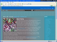
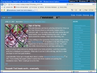
Compare the lefthand image with the one on the right. Look closely and you'll see that the main gray copy area is much farther down on the left. Why?
This is one of the things that make the life of a web designer miserable at times. The same page viewed in different browsers can look different—sometimes in a relatively minor way, sometimes disastrously. Here you see how a page just like the one you're reading appears in Internet Explorer 6.0 (left) and 7.0 (right).
Now that I know this I have to figure out how to fix it. I didn't know it before because I create my site on a Mac, testing in the Firefox and Safari browsers. Then I try it on my office computer (Windows/IE 5?). In all of these browsers things look the same. So I've been obviously lulled into a false sense of security.
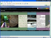
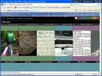
The news is even worse on the home page. At left, in IE6 the title virtually disappears, while it looks fine in IE7. All of a sudden I'm developing a splitting headache. I'm afraid I have some long days ahead of me.
But the reason I started writing this is not to point out how flawed my site is, although that may be the result. The reason I'm talking about it is the way I found out what's happening in these different browsers.
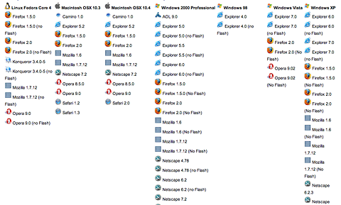
There's an amazing service, Browsercam.com that lets you type in a URL or two, or many more, choose the browers/platforms/screen resolutions/etc. that you want to test with, and within a few minutes you get pages of thumbnails with links to full-size views of what's happening.
Here's a list of browser/platform combinations you can test on:
 You
can also see how your site looks in mobile devices.
So what's the downside to using this way of testing your site? Mostly the cost.
24 hours usage costs $20-25 depending on the options you choose. A month is $60-70, while a year sets you back $500-600.
For a professional web designer, this expense is more than justified. For someone who's just getting started, or a student, the cost seems prohibitive. Still, you can take advantage of the 24-hour free trial like I did.
Browsercam is a well thought-out and implemented service that seems to deliver exactly what it promises. There are more features than I described here, and the money-back guarantee is as good as you'll find anywhere...on paper, at least. I have no experience with how the guarantee actually works.
And if you compare the cost of buying multiple computers to have around to test on, the numbers start to look pretty good.
TOP
ARCHIVE
...MAY
...APRIL
- Student portfolio review
- Dad's birthday
- Red {an orchestra}
- Web 2.0 successes
- Car tattoos
- Great brunch
- TED Talks
- Poor infographic
- Silverlight vs. Flash
- Recycle + exercise
- Better designer tips
- Our Town, CPT
- Audio news
- Old Ford
- Sound of ideas
- Nashville trip
- Dream house
- Soccer in the suburbs
- Hospital story
- Fragments
- Mixed message
- Multiculturalism at Tri-C
- Pretzels
- SEO Pyramid
- Spam, monkeys, Shakespeare
- Sebastien Chevrel
- Spring blossoms
- Towpath Trail
- Designers Toolbox
- Signs of Spring
- Gotta like that
- Map mashup
- Design Can Change
- Grass cutting
- Halloumi cheese
- First sunbathers
- Truck colors
- Classified Creative video