Why I love teaching
I can't describe this without sounding overly dramatic, so bear with me. I just read an email from a student that actually sent a little shiver of excitement up my spine. She was asking for input on her assignment. The project, for Web Publishing I, is to take the text of the U.S. Bill of Rights and put it into web form, to appeal to young Americans who are probably not at all familiar with it.
The typical approach to this project is to create a web page that tries to make the text more readable by using variations of fonts, sizes and colors. This is OK, and sometimes works quite well. It's just not particularly imaginative.
The next level of innovation is to add commentary on the text, sometimes serious, sometimes humorous. This may make it more understandable and/or approachable for young people.
Notch it up a bit, and you get a "quiz" or some links to other sites that makes the website more interactive, richer and possibly entertaining. People of all ages usually enjoy a more active role. This makes it more webby, one of the project goals.
 And now we come to the student's idea that leaps from the typical
to hit the real intent of the project, not just
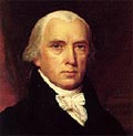
meet the requirements. She's creating a MySpace page for James
Madison that includes the Bill of Rights text.
If your history is a little rusty like mine, Wikipedia calls Madison the "Father of the Constitution" and "Father of the Bill of Rights." What could be more webby and youth-oriented than giving him a MySpace page?
Visit Madison's page and check out his favorite music and videos, become his Friend,too.
It's seeing students do things like this is what makes teaching rewarding.
Memorials
In preparing for today's Interactive Media class I revisited the Sonic Memorial site, set up to collect and archive sounds related to 9-11 and the World Trade Center. The site's Sonic Browser gives you access to the sounds in an interactive, fluid format. I'm not terribly fond of it, but I was surprised that most of the students really disliked it. They wanted a clearer presentation of the material and most found the abstract animations annoying.
We then watched Exhibit 13, created by Blue Man Group shortly after 9-11. This was more successful, although a couple really disliked the music. To me, the music is what makes it work.
Creating interactive work that have strong and clear emotional resonance is something that is exceedingly hard to do. We haven't yet figured out how to use the medium very well. Compared to a more traditional memorial like Arlington West, we have a long way to go.

