Just because you can...
 ...doesn't mean you should. I was reminded of this when I visited one of the most annoying websites ever, built with Sitecube's Designer Website Builder, The Ultimate Do-It-Yourself Web Design Tool with 9000 design possibilities.
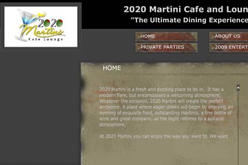
At right is the homepage for a restaurant called 2020 Martini Lounge and Cafe. It's ugly and not sized properly for the average computer screen, but that's more forgivable than the truly horrific and annoying Flash intro that features generic animations and a music loop that diabolically can't be turned off.
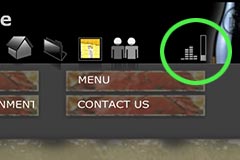 You'll want to stop the music too, and yes, if you look carefully at the row of icons at the top right of the screen you'll see vertical bars that indicate sound. The icon is so subtle that it's easy to miss, but worse yet, when you pull down the bar on the right to lower the volume you'll notice you can't shut it off! The good folks at SiteCube apparently don't want to let you decide whether to listen to music or not.
This sort of DIY web design brings to the online world what we have suffered with in print media since the start of the Desktop Publishing era. You know what I mean: the flyer or brochure that uses ten or twenty different typefaces because...well...because if two or three are interesting then ten times as many must be ten times better.
OK, it's not. No matter what SiteCube tells you. Anymore than their animated buttons or Flash intros or videos will make your website better if it ignores the fundamentals of design, color, and usability.
Top |
|
![]()