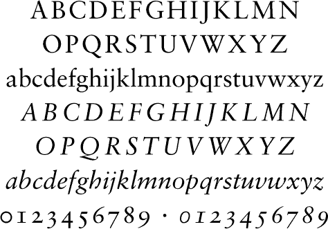
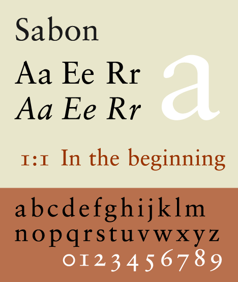
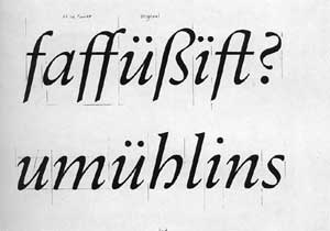
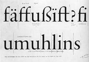
Sabon was the result of many years of preparation. Its model was the 1952 Garamond interpretation which Jacob Sabon and Conrad Berner produced in Frankfurt and which so impressed the young Tschichold. It was the first typeface that was produced with undifferentiated forms for the linotype, monotype and hand setting. Sabon was Tschichold’s most important typeface creation. There were originally three weights: normal, italic and semibold. Linotype expanded the Sabon family in 1984 by adding a cursive semibold weight. ("The New Typography::Translated from German by Ruari McLean")
Early in his career Jan Tschichold wrote at length about all that had gone wrong since the industrialization of printing, and in particular of the complacency and mediocrity dogging typography between the wars. He wrote about revolutionary concepts like asymmetrical page layout and reinvention of the alphabet; and for this bolshevism he was incarcerated by the Nazis. Just as with Bodoni and Caslon, there is no one font called Garamond. Sabon, which Tschichold designed in 1964, is very true to Claude Garamond’s type design. In its quiet elegance and perfect internal proportions, Sabon, if used well, may be the most legible text face of all, and its digital incarnation is eminently usable. ("textism")
