Memory map
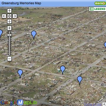
If the vertical scale and the blue markers look familiar, it's because you're looking at another Google Maps mashup like we've talked about before.
Unlike the one I made of our walk along the Cotswold Way, this map has a decidedly more serious intent. It was created by the newspaper in Greensburg, Kansas as an online memorial to people and places in the town that was nearly wiped out by a tornado.
This collection of aerial photos shows how wide a swath the tornado cut through town on May 4, 2007.
The map had only a few markers on it yesterday when I first visited it. Today it has nearly 40, and I'll bet that in a week it will have hundreds. Go to the map now and see for yourself.
The most powerful aspect of this use of web technology provided by MapLib.net is that anyone can add markers and/or comment on those already in place. It allows a community to form around the map, a very Web 2.0 type of thing.
As of today no one is using the comment feature, but I suspect that's partly because most people don't realize it's available. Again, I'm guessing that once someone starts commenting, that aspect will blossom.
I'm also pretty sure that—like Google Maps itself—people can add images to the the comment boxes. I expect that "before" images of homes and stores in the devastated city will soon appear, adding a whole new layer of meaning to the map.
I'm really excited by the possibilities of MapLib.net technology, which works with images of any kind. Here's a detailed graphic explaining the TV show Lost, a map of Middle Earth from Lord of the Rings, and notes on someone's Windows login screen.
I'm trying to decide what image to use as my first attempt at building an interactive image in this format. An aerial photo of my neighborhood? Nah, too predictable. Got any suggestions?
TOP
Portfolio show, Day Two
 The
second dayof the Classified
Creative student portfolio
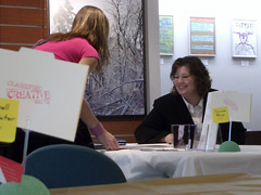
show was a lot like the first. The
number of people who visited on a beautiful Saturday afternoon was about
half what we hoped for.
Still and all, it was a success in every other respect. A respectable number of Tri-C students showed up, either out of curiosity or to support their fellow students. There were mothers, fathers, aunts, nieces and girlfriends who stopped in.
Most importantly, a handful of potential employers made the rounds of the tables, and we're hoping that a few at least found who they were looking for.
Changes suggested for next year: perhaps do a lunchtime session so people don't have to take time off work to visit the show. Possibly divide the students by specialty (video, graphic design, web/interactive) to make it easier for people looking for specific skills/talents. And the most frequent suggestion: music. Not sure why we didn't think of it, but music in the background would have made for a more pleasant atmosphere overall. Hmm... Frank Sinatra or hiphop? Next year's planning committee will have to wrestle with this one.
TOP
ARCHIVE
MAY
- Russian visa 5/11/07
- Portfolio Show 1 5/11/07
- Encyclopedia of Life 5/10/07
- Neighborhood life 5/10/07
- Safe area 5/9/07
- Crile Building 5/9/07
- Passport photo 5/8/07
- Interactive toys 5/8/07
- Long night 5/7/07
- Lilacs 5/7/07
- Forgot to remember 5/6/07
- Cyclist colors 5/6/07
- Spring colors 5/5/07
- Click! judging 5/5/07
- Massage 5/4/07
- Rocky River park 5/4/07
- Beauty & beholder 5/3/07
- Browsercam 5/3/07
- Night game 5/2/07
- Classified website 5/2/07
- Classified video 5/1/07
APRIL
- Student portfolio review
- Dad's birthday
- Red {an orchestra}
- Web 2.0 successes
- Car tattoos
- Great brunch
- TED Talks
- Poor infographic
- Silverlight vs. Flash
- Recycle + exercise
- Better designer tips
- Our Town, CPT
- Audio news
- Old Ford
- Sound of ideas
- Nashville trip
- Dream house
- Soccer in the suburbs
- Hospital story
- Fragments
- Mixed message
- Multiculturalism at Tri-C
- Pretzels
- SEO Pyramid
- Spam, monkeys, Shakespeare
- Sebastien Chevrel
- Spring blossoms
- Towpath Trail
- Designers Toolbox
- Signs of Spring
- Gotta like that
- Map mashup
- Design Can Change
- Grass cutting
- Halloumi cheese
- First sunbathers
- Truck colors