Checklists
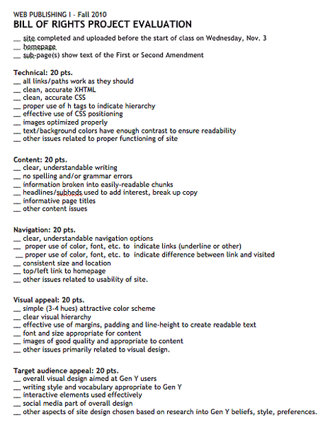
 A couple of days ago I put together a checklist for students to use as they wrap up work on their midterm project in Web Publishing I.
The project goal is to create a website that will explain the Bill of Rights to a young, Gen Y audience.
As with all of our projects, there are both technical and design/usability issues to be considered. Hence the need for a detailed checklist (the same one I'll use when grading them).
Students had already seen this information in the project description, but there it's written in paragraph form. A checklist seems easier to understand and more useful as a way of making sure you got everything done properly.
 Better yet
Given all of the above, I was thrilled to find an online resource that makes the checklist more interactive, maybe even fun. The site is called Launchlist.
From its retro logo to its irreverent link to site information (WTF?), the sense you get is more play than work. In fact, I'd say this site has a lot of Gen Y appeal. Beyond that, it's well thought out and super-easy to use.
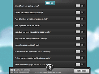
While Launchlist covers more technical issues than I need for my class, and doesn't have much to say about readability and usability (which I consider critical), you can easily customize it. Skip any existing question by setting it as Not Applicable (N/A), and add questions of your own at the bottom of the list. There's also an option to add comments to any question, another way of making them your own.
 When you finish using the Launchlist and hit "Submit" you get a summary of what remains to be done and advice as to whether you are ready to launch your site or not. A detailed report is sent to whomever you specify.
Hmm... what if I have my students use this before uploading their final project? If they do it a week before the deadline it will help them focus on what must be done while there's still time.
Think I'm going to give it a try!
