MARCH 25, 2009
Friends, Facebook, feedback
Until recently Facebook has been the poster child for what's called "social networking" sites on the web. Twitter is getting more buzz these days, but I think Facebook's richer environment will keep it on top. What I mean is that Twitter permits only one type of communication, a maximum 140 character text message, while Facebook allows you to use text, photos, video, create groups, quizzes and other ways of communicating. Think three dimensional vs. one dimensional.
With both you can have "friends"—called "followers" in the Twitterverse—who are notified when you post anything online. A Facebook "friendship" is automatically two-way: they see your posts and you see theirs. With Twitter someone can follow you without you being obligated to follow them back. I take it as a compliment when someone follows me but rarely follow in return. On Facebook I'm selective with potential friends I approve, since it starts a two-way online relationship.
Now, are these real friends? Heck yeah, mostly. I've gotten closer to people I knew pre-FB but for various reasons—mostly distance—rarely see. I've asked FB friends for help with projects I'm working on and gotten encouragement and advice. As an example I thought I'd fill you in on some of the discussion concerning the website I'm developing for my son Danny's construction company.
Feedback - survey
First I created a short online survey asking people what they look for when hiring a contractor and what they hope to find on the contractor's website. Overwhelmingly, people want "honesty/reliability" and consider the contractor's "reputation" to be of paramount importance. A couple of other suggestions:
- "Creativity, communication skills, sense of humor, imagination"
- "Someone actually picked up the phone and spoke to me when I called rather than have a answering machine"
- "Physical appearance, type of vehicle, cards, prompt reply, ATTITUDE"
On the website they want to see "pictures of completed projects" and "description of services." To a lesser degree they want to see customer testimonials. Other ideas for the website:
- "Maybe the contractor's reflections about his or her own work?"
- "Something personal why you like doing this work, why you think you are the best person to hire, what would I like about your ideas, would you listen to my ideas, could you translate my ideas into a space that makes sense to both of us?"
- "Photo of crew and owner, photos of past customers with owner, wide range of project types illustrated from small to large"
If you haven't taken our 5-question survey, we'd love to hear your thoughts.
Feedback - layout ideas
 Since 60 people generously shared their opinions via the survey, I asked my FB friends to comment on three ideas for the website homepage. Again, I received many thoughtful, helpful, and sometimes conflicting opinions.
You can see the three ideas starting here with Layout #1. As of today, #3 has gotten the most votes, with #1 and #2 splitting the rest evenly.
Much of the discussion has revolved around the testimonials, which I placed prominently on the homepage. Danny himself is uncomfortable with this, but since in the survey people clearly told us they value "honesty/reliability" and "reputation" I think the best way to establish this is through the words of customers. They have been getting mixed reviews:
- "Frankly, I'm not blown away by any of the current pictures or quotes"
- "The client testimonials are a little lame for me."
- "The testimonials are too large"
In reading over all the comments I think the problem is that the words and pictures come across as phony, which is understandable because they are...phony. I just grabbed stock photos off the web and wrote "typical" comments to use as placeholders. I completely agree with the sentiment "I like quotes and pictures of real live people with complete with blemishes." That's what we'll have when we talk with real customers. We plan to videotape those who are willing, and will feature short clips on the site.
This input from FB (and non-FB) friends has been invaluable in shaping the site, and I wanted to share it both because some of you have asked to be kept in the loop, and to demonstrate how social networking works in a very pragmatic way.
Kitchen progress - Day 8
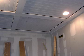
 Yesterday you saw the start of the fancy ceiling treatment that Danny created.
Today it's nearly complete, with final sanding and caulking in the morning to be followed by a coat of gloss white paint. Neither Joanne nor I had any idea other than to paint the ceiling, so this has turned out to be a nice surprise.
It's also a good example of how a contractor can bring something to the job if you involve them in the design process as well.
Top |
|
![]()