Nice day, bad choice
 As I walked through the parking lot on an unusually warm and sunny November afternoon, I thought maybe I should skip the afternoon of meetings and enjoy the day. Unfortunately I pushed this impulse aside and went inside the suburban Holiday-Marriot-Comfort-Western-Inn.
I hoped that the World Usability Day program and speakers would make it an afternoon well-spent, but I left disappointed.
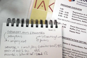
The first talk, Subscribers, Fans and Followers, was informative and interesting, but seemed longer than necessary for the information it provided. This was a theme that got only more noticeable as they day went on.
I sat in on parts of sessions on Personas, HTML5, Web Analytics, Prototyping and more. Each session was informative in its way, but none were particularly interesting, and all seemed too long. Not one speaker made any serious effort to involve his/her audience, in itself a usability issue in my book.
At the end of the day, I had a few brochures and information sheets that I'll look at later (maybe), a small notebook with a dozen pages of notes, and a complete lack of enthusiasm for usability. During the last session I felt like a "bad" student in class: constantly checking Facebook on my iPhone, reading the New York Times and Cleveland.com, and waiting for the bell to ring session to end.
Walking to my car in the now-dark parking lot, I regretted not enjoying the sunshine.
