More logos
I think we've closing in on a logo for my son's construction company. A month has gone by since we had our first discussion, and I've tried more variations plus a couple of new ideas. We've narrowed it down to three possibilities:
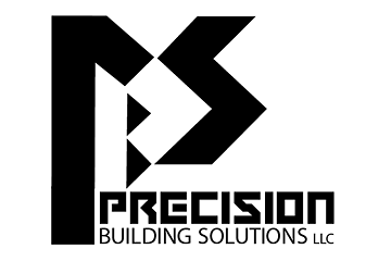 In this, one of the early ideas, the letters PBS are semi-hidden in a more abstract graphic.
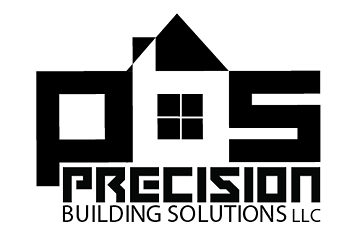 Here PBS becomes a small cityscape that includes a house and two boxy shapes, indicating the residential and commercial sides of the company.
The main font is the same as above.
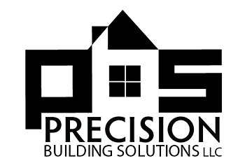 A simpler font makes the company name easier to read and shifts the visual focus more to the graphic.
Feedback?
As usual, I'm interested in your comments. Since design, like life itself, is a continuing series of trade- offs, it would be helpful to hear your thoughts on the pros & cons of each idea. Or whatever.
Top |
|
![]()