JULY 8, 2009
The new, improved Cleveland Museum of Art
After supper we decided to check out the new wing that opened recently at the Cleveland Museum of Art. The opening bash took place on June 21st while we were on Kelleys Island, a party that I'm sorry to have missed.
 We walked in through the old "front" entrance facing the lagoon rather than the current main entrance on the other side. We wandered through the refurbished Armor Court to a new door and...
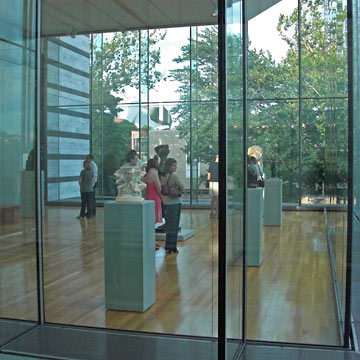
What a difference. A big emphasis in the museum's renovation has been adding light and views to a dark, closed in building. The corridor that we walked through, connecting the original 1916 building with the 1971 Breuer addition, is all glass.
It led us to a spacious and airy gallery filled with the museum's collection of Rodin sculptures. This too is something new. In the past these sculptures were in different galleries, probably arranged by time period. Now they are grouped in a single gallery, something we saw later in a gallery devoted to the work of Picasso.
One of the most dramatic differences you'll notice when you visit is that the museum is visibly part of the University Circle neighborhood that surrounds it. Of course that's always been true, but you wouldn't have noticed. Used to be that the museum's windows were placed seemingly as afterthoughts, sometimes shielded with screens that obscured the view. Now what's outside the glass is part of the environment the art lives in.
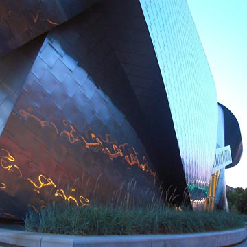
 One of the highlights of this is the Frank Gehry-designer Peter B. Lewis building on the Case Western Reserve campus. In the photo above you can see its curving, coiling silver roof through the far wall of the gallery. At right the pinkish orange of the sunset reflects off one of its street-level walls.
I'm a big fan of Gehry's exploration of curvy metal shapes. The Disney Concert Hall in Los Angeles is more famous, but I think the smaller Lewis building's combination of metal, brick and glass is far more exciting.
Top |
|
![]()