MAY 11, 2009
Kitchen is open for business!
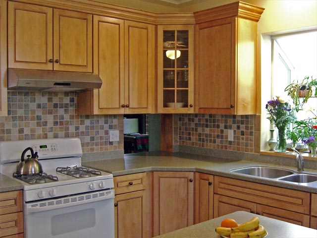
Looking toward the dining room where we lowered the passthrough opening so that it lined up with the countertop.Here's a look at the results of our two-month long kitchen rehab. We started without a real clear plan of what we wanted, and the look evolved as the work progressed.
Mouse over image to enlarge ->
For example, we had to decide on a countertop color by looking at only a small (2" x 3") sample. We were a little concerned that when we saw it covering the sizable area of counter that it might not be what we expected.
When the counters were installed, though, we were happy. At this point we still had no idea of what the backsplash would look like, but at least we could actually see what we had to work with (you can see it here too).
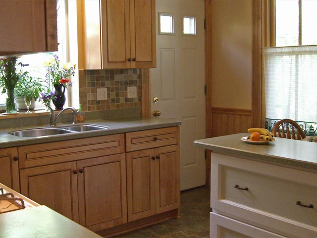
The small island gives us both workspace and storage in two big drawers.
We added a small island in the center of the kitchen to create more work space. Of course the big "garden window" over the sink brings in more light plus gives Joanne a place for lots of plants and flowers.
Everything you see in this photo except the door to the outside is brand new. It took a while to find the wood for the wainscoting that replicates what we had there before, but we finally got it.
Our goal was to retain as much of the former look as possible, minus the nail holes, damaged wood and other problems left over from having to strip old finish off of the original woodwork. It turned out great.
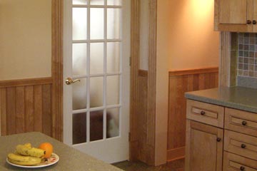
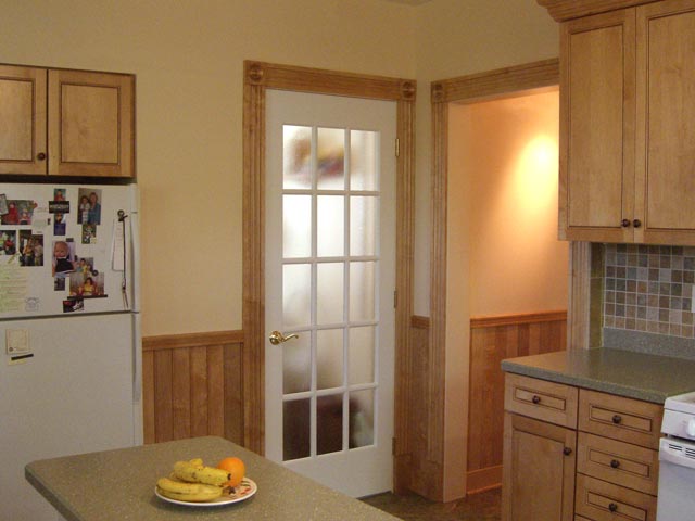
The former pantry now holds a washer and dryer as well as shelves for storage.
Behind the French door is our washer and dryer, moved up from the basement. We still haven't figured out where to keep all our canned goods and other stuff that filled the room when it was the pantry.
The small hallway at the right was always kind of semi-finished, with funky molding and drywall. Now new wainscoting, trim and lighting makes it beautiful.
Top |
|
![]()