OCTOBER 13, 2009
New semester, new look
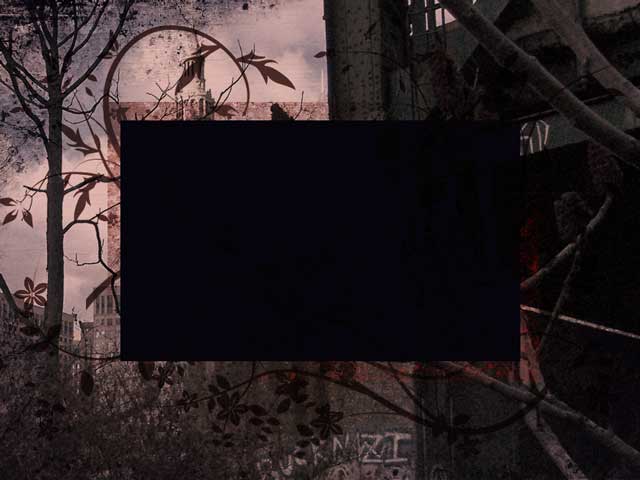
 Every semester when it comes time to put together a website for student projects I try to approach it a little differently. Today I started with the idea of a grunge look, using this tutorial to get an idea of how to approach it.
My lack of patience led me to veer away from the step-by-step instructions, but I'm reasonably happy with the results anyway. This image will be the background for the site's homepage. LInks to their work will be in the dark box in the center. Tomorrow I should have a working version.
Top |
|
![]()
