APRIL 7, 2009
Precisely!
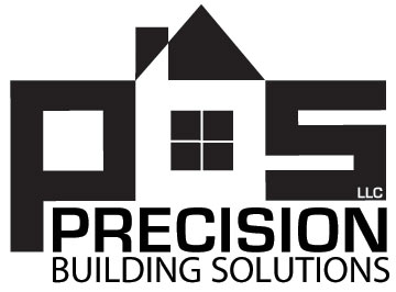
 After a month or so we've finally arrived at a new logo for my son's construction company. Yesterday we decided on the overall design, today we looked at 20 or so font variations. And the winner is...
One of the things we struggled with was having a "house" shape as part of the logo. I argued against it, thinking that it would tie the company too closely to residential work when they also hope to grow their commercial contracting.
I think that what we arrived at gets the house idea across clearly but puts it in the context of a mini-skyline that may suggest commercial structures with the rectangular shapes. The main font, called "Eurostile," combines rectangles with a rounded, more organic look. The best of both worlds, we hope.
As always, I welcome your comments.
Top |
|
![]()