JULY 16, 2009
People of earth are creative with their bathrooms
 Hard to argue with the headline (above) written by the Taiwanese blogger Yufu for his collection of amazing signs (amazing-good and amazing-bad) that people have created to label the men's and women's restrooms.
The one at right is both clear and funny, not always the case.
Me too
OK, I'll admit to a shared fascination with restroom signs. I haven't organized my collection yet, but here are a few from the past year or two.
MORE: In November 2012 I started a blog to showcase restroom signs and warning messages from around the world. Take a look: WhichOneIsIt?
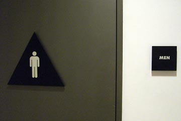 The San Francisco Museum of Contemporary Art makes it as clear as possible: an icon, a unique shape for the sign, even a helpful label on the side.
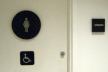 I apologize for the blurry photo, but standing outside the women's restroom with a camera makes me feel very conspicuous, so I rushed it. Not that standing outside the men's restroom with a camera is a lot better.
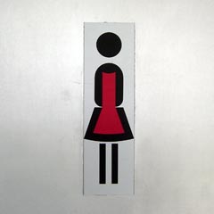
 The Swiss are thought to be quite precise, and these signs at a cable car station make their point with a minimum of fuss.

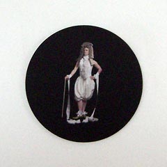 Strangely, the ultra-modern, minimalist Citizen M hotel in Amsterdam takes a very different approach.
You have to get very close to the door before you can makes sense of these, and even then, good luck.
A different problem
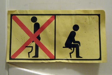 Europeans seem to be taking aim—so to speak—at changing male behavior. Haven't seen this in the U.S. yet and don't expect to.
Compare this literal, stern approach with a more humorous version I saw on a Finnish intercity bus. As I stood there peeing.
A still different problem
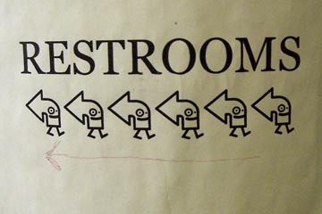 What's wrong with this sign?
Hint: notice the hand-drawn arrow at the bottom.
The restrooms are to the left, but that's not what we see when we look at line of marching arrows.
Even though the arrowheads point left, the added faces and feet prompt our brains to see a line of marching figures. Marching to the right. Couple this with our tendency to scan left to right, the way we read, and the sign screams to the right. Cuteness has trumped clarity.
 Fixing it isn't hard. Forget about being "clever" or "creative," just be clear.
This is one of the main lessons that I hope students learn in the Intro to Visual Communications class that I teach at Cuyahoga Community College. Communication—and good design—is about effectiveness more than creativity.
If you can work a bit of humor into it, as the sign that started this article does, so much the better.
Top |
|
![]()
