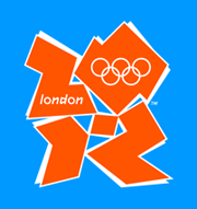
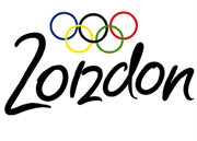
London Olympics logo
If you had any doubts about the power of design or the importance of visual communication in today's society, the ongoing story of the logo recently introduced for the 2012 London Olympics should correct that. Depending on who you talk to, it's either "bold and youthful" or "ridiculous."
The fact that thousands of people posted comments on the BBC blog and nearly fifty thousand signed an online petition calling for the scrapping of the logo should be reassuring to designers worldwide. Clearly people notice and care about the visual identity of the event and their city.
 The story:
Olympics organizers explain the idea behind the logo, "Everyone's Games."
This article includes a slideshow of logos from more than a dozen previous
Olymics/cities that provides a great basis of comparison.
The explanation:
More details on why and how this logo design was created. "The intention
was that by being bold, spirited and even discordant, it would echo London's
qualities as a modern, diverse and vibrant city."
The video:
A relatively downbeat, gritty series of vignettes about a diverse group of Londoners inspired to change their lives by the coming Olympics. The logo has a very minor appearance at the end, but you get a good sense of the branding approach it's part of.
The petition:
 48,000+ people say "We, the undersigned, call on the London Olympic committee
to scrap and change the ridiculous logo unveiled for the London 2012 Olympics."
The alternatives:
The BBC invited people to send in their own ideas, then staged their own
vote for a favorite. 40% of the votes went to this logo designed by Richard
Voysey.
My opinion? I'm voting for the official logo. It's definitely not your father's Olympics logo. It's lively, urban, colorful and youthful. Now, can a logo rekindle youthful interest in sports and the Olympics? That's asking a whole lot of a symbol. But this one at least has a fighting chance.
TOP | | |