APRIL 27, 2009
Colors of the Canyon
 Much of the day—too much—I was working on graphics to go with the article I'm writing about our recent trip to the Grand Canyon, tentatively titled From the Cuyahoga to the Colorado: Flatlanders hike to the bottom of the Grand Canyon and back; lessons they learned, sometimes the hard way.
[See an outline/draft of it here, and please send me your comments]
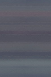
Anyway, I want the visuals to reflect what we saw, so created a background image using the actual colors of the Canyon. As you see, surprisingly it's very blue-green, not red-orange as you might expect. The greenness of the canyon, probably a Springtime phenomenon, surprised us at the time, too.
Making of the background
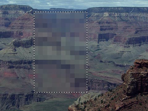
 Here, I know you don't believe me: take a look at the original photo with the area selected that ultimately became the background tile.
I used Photoshop's Mosaic filter on the outlined section to simplify the colors. I then used the Motion Blur filter to stretch the blocks into horizontal lines.
When used on a web page this small "tile" will repeat both vertically and horizontally to fill the browser window, whatever its size. The pattern on the tile must blend at the sides, top and bottom so the pattern looks seamless.
There are a couple of ways to create a background tile. I used a tutorial from AssaultBlog to refresh my memory on how. You can see the result full size by taking a look at the article.
Top |
|
![]()