APRIL 30, 2009
Color-coordinated
 Funny what catches your eye.
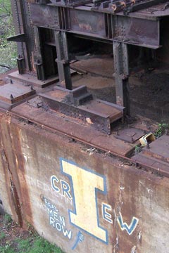
As Jared & I walked across a bridge in the Flats we were talking about the abandoned railroad bridge next to it. Embossed in the concrete was the year "1954," although the rusted steel hulk looked older than 55 years.
The St. Ignatius crew team which practices nearby had marked the concrete base as their own. The blue and yellow school colors stood out in contrast with rusty steel and stained concrete.
 Wedged in a crack at the top was an old cooler that accidentally—or deliberately?—matched the school colors perfectly.
More about color
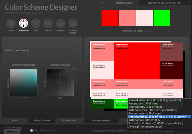
If you work with color day in and day out as I do, you know that finding a good color scheme isn't just random luck. Education, training, a good eye, and a web application like Color Scheme Designer 3 help a lot. There are quite a few websites and stand-alone applications that help with task. I've written about Adobe Kuler and others previously.

Compared to the best of them CSD 3 has a lot to recommend it. I really like how easily you can adjust saturation, brightness and contrast of any scheme to your taste. Or you can pick one of 18 presets ranging from Max Contrast to Almost Grays (light).
Mouseover image to see more ->
If you're interested in web usability you can add an overlay of text in white, gray and black to check legibility. And if you're really serious, you can view the color scheme as people with eight types of color-blindness would see them.
A must-have tool for any web designer, give Color Scheme Designer 3 a try.
Top |
|
![]()