 Change is good
Especially if you're a website.
As the web becomes more about smartphones and tablets, and less about desktop computers with big monitors, it's absolutely necessary that we design for devices of a staggering variety of sizes and shapes.
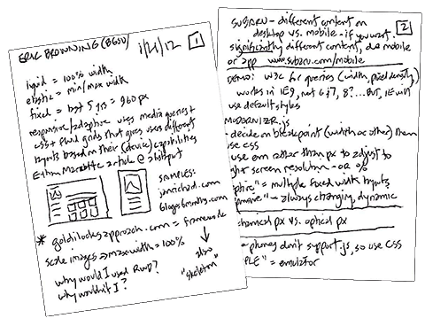
At today's WebSIG meeting, local designer Eric Browning gave a quick history of how we've handled similar issues as computer screen sizes grew —"liquid/fluid" and "elastic" design.
The slides from Eric's presentation are online: most importantly look at #12 for a list of links for more information on this topic.
Queries
Eric mentioned an article at Alistapart.com by Ethan Marcotte as setting the stage for this new way of thinking about web design. Definitely worth reading.
 Long story short, a key part of responsive design is using CSS media queries to find out what type of device is accessing the website.
Here's an example similar to the one Eric is pointing to:
<link rel="stylesheet" type="text/css" media="screen and (max-device-width: 480px)" href="small.css" />
The query checks to see if the device has a screen that's 480 pixels wide or less, and loads a stylesheet tailored to that width. Pretty clever, isn't it?
But responsive design involves more than different stylesheets. You may use images that scale larger and smaller, or load different images depending on the screen size. You may use floats to allow your content to move around as the screen size changes. It takes planning to make this work.
After Eric's talk and demo I'm anxious to give responsive design a try. And speaking of that...
Take a look
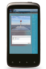
 Use Google's GoMo website to see how any site looks on a mobile phone.
I tried it with my own website and the homepage is a disaster.
The daily navigation, which scrolls horizontally on a computer, gets shrunk to fit the phone (see it there at the top?) making the text so tiny as to be useless.
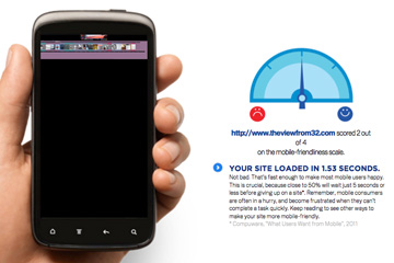
An inside page, like the one from January 4, fares a little better but is still basically unreadable.
Got some work ahead of me.
Are you mobile-friendly?
If you have any experience (good or bad) with responsive web design, please share your thoughts below.