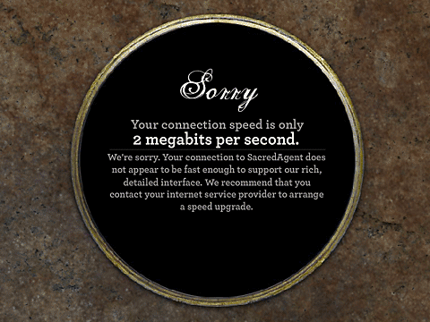
Too slow for enlightenment
 A design firm called SulkyBros shows off in their portfolio an interface for an organization called Sacred Agent.
Looked like an interesting concept, so I went to the SacredAgent site only to find that I'm too technologically backward to achieve enlightenment.
Uh guys, don't hold your breath waiting for me to "contact my service provider and arrange for a speed upgrade" so I can return to your damn site.
Who's idea was this?
I don't know whether this bit of user-hostility is the result of a demanding client or clueless designer/developers, but either way it's a big problem.
From the description of the project on their site, I'm leaning toward pinning it on the designers:
Throughout the SacredAgent design process, there was always an awareness of, and a bit of tension between, reality versus interaction. There is no pool that can display text, nor lake that hosts Sage Cards. This struggle was most pronounced in the interface design process – how to rest the interactive level of an experience in a land striving for reality....While clearly not reality, we hope it’s a land others enjoy viewing.
If the price of visiting this land is upgrading my internet connection (mine is wireless DSL, not exactly dial-up modem speed) I'm going to seek enlightenment somewhere else. Somewhere that actually wants me to visit.