Sharks!
The grandkids had the day off from school, so we joined lots of other families in a long line waiting to get into the Greater Cleveland Aquarium.
Was it worth the wait and the $100+ price tag? Hard to say. I'm not a fan of aquariums (aquarii?) in general, so I don't have much of a basis for comparision.
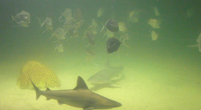
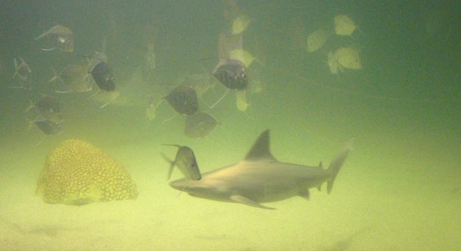
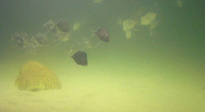
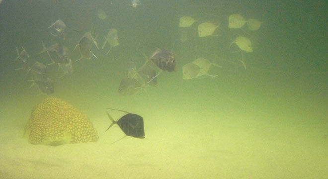
I did love the Shark Tank, though, where sleek sharks cruise among schools of silvery fish.
Architecture
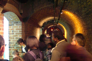 The best thing about the new attraction built inside of the Powerhouse is how it uses old coal tunnels and other architectural features to house exhibits. A good example of adaptive reuse.
A mess
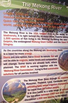 The worst thing: poorly-design signage that's virtually impossible to read.
If my first-semester Visual Communication Foundation students went crazy like this, with multiple colors, shadows and background images I'd cut them some slack. For newbies, the "variety = interesting" urge is hard to resist.
For a professional design firm I'd hope that "less is more" would be part of their design vocabulary. In this case, I guess not.
The overuse of red text makes for a jumble of words and colors. Background images fight for attention with text. There's no sense of hierarchy: nothing looks more important than anything else, except for the headline at the top.
If the goal was to keep people moving from shiny tank to shiny tank without learning anything about the fish or environment, they've accomplished it.
What a shame. They could do so much better.