Enjoying the park

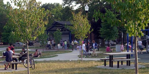
This may not look like an unusual scene, and in some ways it isn't.
It's just a mix of people, from the red-headed guy with a laptop at lower left. next to the young Hispanic guys with a young couple on the grass behind them, to the parents and kids enjoying the swings at right while others stand around talking.
What makes this scene special to me is that it took place this evening across 32nd street at Fairview Park, recently renovated by the City of Cleveland. I've lived in the city long enough to know that most good ideas never get past the good idea stage, but somehow this one did.
A couple of energetic neighbors spent a year or more organizing meetings, staging events at the park and I'm sure attending innumberable meetings with representatives of the city. About a year went by after the planning was completed before construction finally started, and it proceeded in fits and starts for months. But eventually a much bigger kids' play area was finished, tables were installed, new walkways and lighting put in, trees planted, and wonder of wonders, a water play area built and turned on.
This is the vision we all talked about for years, and it actually happened due to a lot of hard work by a lot of people. Kind of makes you feel good.
TOP | | |
If at first you don't succeed, try calling Tech Support?
First let me explain, I've had negative experiences with Tech Support before, even Apple's best-in-the-industry support. I've had my share of interminable waits on hold, struggles with lengthy voicemail menus, and eventual conversation with people whose accents were difficult to understand. So when I got my new iMac I tried to figure out on my own how to transfer my old files. This accounted for many frustrating hours yesterday and the day before. It occurred to my to call Tech Support, but I avoided doing so.
Today I finally bit the bullet, called 1-800-MY-APPLE, and to my surprise was talking with a human being within a minute or two, with only 2 or 3 keypresses. His accent did leave a bit to be desired, but in a few minutes I learned what had happened and how to correct it. Long story short, the Migration Assistant had in fact done its job and copied all my files, I just didn't know how to find them.
The solution to sorting things out will take a little while still, but at least I'm not dead in the water. I've got my email pretty much back to its former state, although my Address Book is still missing in action. Looks like tomorrow I need to make another call.
TOP | | |
Useful info for web designers
I get a half-dozen or so email newsletters on a regular basis, and one of the most useful from a web design point of view is the SitePoint Design View. You can subscribe to it here, along with several others.
Photoshop CS3 selection tool
One of today's articles includes a nice demo of a spiffy new selection tool in Photoshop CS3. The new Quick Select tool builds on the earlier Magic Wand and Background Eraser tools, then adds a panel that includes selection adjustments like Feather, Expand/Contract, Radius, and Contrast. If you've worked with Photoshop before, you'll notice that many of these features have been around for a while, but now they're combined into a single process. This is evolution, not revolution, but thoughtful nonetheless.
Out of the Box CSS tutorial
Yesterday SitePoint had a very thorough and eye-opening CSS tutorial called Breaking Out of the Box.
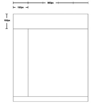
The article starts with a brief explanation of the value of using a grid to organize and clarify the information on a site. The grid is developed in the form of wireframes, visual guides that outline the visual structure of the site without getting into specific artwork. By following the tutorial you get introduced to a logical workflow for designing a website. This is very useful for students, and I suspect a few professionals will benefit too.
A typical wireframe looks something like this:

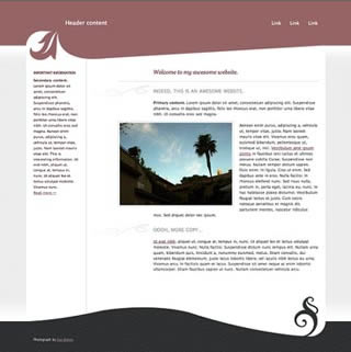
As you work through the tutorial using the downloadable files that are included, you create a CSS style sheet that refines how the information is presented, using background colors and images, among other techniques. By Step 3 you're learning how "you can fracture or abstract that grid to make your layout more dynamic and interesting."
When you finish Step 4 you have this:

Not too shabby, and you've learned quite a bit about CSS along the way. It took me a little more than an hour to finish the tutorial, including very frequent previewing to see that each change/addition to the CSS was doing. It would have gone a bit quicker if I'd have worked in Dreamweaver's Code View, since the auto-complete feature speeds up coding. But I wanted to be a purist about it. Got a some help from a useful freeware HTML editor for Mac OSX called Taco HTML Edit.
One problem with the tutorial is that there are a couple of additions to the code needed to make it work properly in IE6. I discovered this only by reading the comments from other users at the end of the article. Since the author in several posts of her own agreed with the changes needed and in fact apologized for her slip-up, why hasn't SitePoint updated the tutorial with the correct code?
With this one reservation, it's still a great tutorial!
TOP | | |
ARCHIVE
JUNE
- New computer 2 6/12/07
- Student thanks 6/12/07
- New computer 6/11/07
- Protest 6/10/07
- Sunset 6/10/07
- Olympics logo 6/9/07
- Street life 6/8/07
- Camera damage 6/8/07
- Sunset 6/7/07
- Architecture 6/7/07
- Web info 6/6/07
- Surfing CLE 6/5/07
- Old notes 6/4/07
- Good breakfast 6/3/07
- "Conventional" green 6/3/07
- Nashville Day 3 6/2/07
- Nashville Day 2 6/1/07
MAY
- Nashville Day 1 5/31/07
- Peppers& plans 5/30/07
- Street life? 5/29/07
- Memorials 5/28/07
- Blog or not? 5/28/07
- Breakfast @ Market 5/27/07
- Restaurant scene 5/27/07
- Anne DeChant 5/26/07
- New computer 5/26/07
- Computer woes Pt.2 5/26/07
- Computer woes 5/25/07
- Cleveland sunshine 5/25/07
- Amazon recommends 5/24/07
- Long Tail 5/24/07
- Click! winners 5/22/07
- Honda F1 car 5/21/07
- Human directionals 5/20/07
- Sunday sounds 5/20/7
- Marathon 5/20/07
- Icograda, Havana 5/19/07
- Web + politics 5/18/07
- Design excellence 5/18/07
- Sunset 5/18/07
- Flickrvision 5/17/07
- Tri-C Graduation 5/17/07
- Haircut Day 2007 5/16/07
- Kids' Art Show 5/16/07
- Web articles 5/15/07
- Birds' life 5/14/07
- Chess players 5/13/07
- Portfolio Show 2 5/12/07
- Memory map 5/12/07
- Russian visa 5/11/07
- Portfolio Show 1 5/11/07
- Encyclopedia of Life 5/10/07
- Neighborhood life 5/10/07
- Safe area 5/9/07
- Crile Building 5/9/07
- Passport photo 5/8/07
- Interactive toys 5/8/07
- Long night 5/7/07
- Lilacs 5/7/07
- Forgot to remember 5/6/07
- Cyclist colors 5/6/07
- Spring colors 5/5/07
- Click! judging 5/5/07
- Massage 5/4/07
- Rocky River park 5/4/07
- Beauty & beholder 5/3/07
- Browsercam 5/3/07
- Night game 5/2/07
- Classified website 5/2/07
- Classified video 5/1/07
APRIL
- Student portfolio review
- Dad's birthday
- Red {an orchestra}
- Web 2.0 successes
- Car tattoos
- Great brunch
- TED Talks
- Poor infographic
- Silverlight vs. Flash
- Recycle + exercise
- Better designer tips
- Our Town, CPT
- Audio news
- Old Ford
- Sound of ideas
- Nashville trip
- Dream house
- Soccer in the suburbs
- Hospital story
- Fragments
- Mixed message
- Multiculturalism at Tri-C
- Pretzels
- SEO Pyramid
- Spam, monkeys, Shakespeare
- Sebastien Chevrel
- Spring blossoms
- Towpath Trail
- Designers Toolbox
- Signs of Spring
- Gotta like that
- Map mashup
- Design Can Change
- Grass cutting
- Halloumi cheese
- First sunbathers
- Truck colors