David Carson
 The Hilman Curtis video produced for AIGA, the American Institute of Graphic Arts, reminds me of the first time I saw a copy of RayGun, the magazine designed by Carson that made him famous.
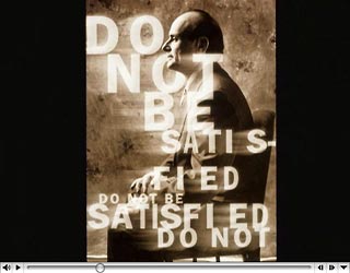
I hated it. HATED it. I thought it was an affront to designers everywhere, it was so bad. Broke all the rules of what a magazine should look like.
As it turns out, Carson's outrageous (at the time) way of working with type and images became the popular "grunge" look that designers everywhere imitated, most poorly. I became a fan of his work, coming to value its expressiveness—sometimes at the expense of legibility.
This seems particulary relevant now with the big debate about the London Olympics logo. I think a lot of people—designers included—don't like the logo because it just doesn't look like an Olympics logos "should" look, in the same way I thought RayGun didn't look like a magazine should. I say, give the logo a chance despite its awkward look, because I think it's trying to reshape our view of what the Olympics is about.
Maybe a few years from now we'll look back on the London Olympics logo as a start of a new approach. Or maybe not.
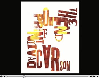 In the interest of full disclosure I have to explain that in 1995 I took a workshop that Carson taught at Kent State one summer and ended up spending about four hours working with him in the school's Type High letterpress shop.
Carson wanted to try a letterpress version of a cover for his upcoming book The End of Print. He moved the wood and metal type around, and I locked it into place. He made suggestion about color, and I inked and printed a couple hundred variations.
At one point in the video you see the result, which ended up as the back cover of the first edition of the book.
It wasn't until later when I spent time looking through the book itself that I began to see the power and beauty of his work. He's had hits and misses, as we all do, but at its best his work forces us to think about ideas by making the words harder to read, not easier. Typographic heresy at the time. And as thousands of mostly-young designers have shown since, not as easy to do as it looks.
TOP | | |
LeBron Etch A Sketch
I guess everyone who made fun of George Vlosich for spending too much time playing with his Etch A Sketch feels pretty silly right now.
With prices for custom pieces starting at $7,500, George has become famous, and maybe rich.
The video shows him creating a LeBron James portrait— a process of many, many hours—condensed down to about three minutes and accompanyed by a rap soundtrack written by Vlosich himself.
See Vlosich's work at his Etched In Time website.
Think you can do better? Try it at Online Etch A Sketch.
TOP | | |
ARCHIVE
JUNE
- Web info 6/13/07
- Tech Support 6/13/07
- Fairview Park 6/13/07
- New computer 2 6/12/07
- Student thanks 6/12/07
- New computer 6/11/07
- Protest 6/10/07
- Sunset 6/10/07
- Olympics logo 6/9/07
- Street life 6/8/07
- Camera damage 6/8/07
- Sunset 6/7/07
- Architecture 6/7/07
- Web info 6/6/07
- Surfing CLE 6/5/07
- Old notes 6/4/07
- Good breakfast 6/3/07
- "Conventional" green 6/3/07
- Nashville Day 3 6/2/07
- Nashville Day 2 6/1/07
MAY
- Nashville Day 1 5/31/07
- Peppers& plans 5/30/07
- Street life? 5/29/07
- Memorials 5/28/07
- Blog or not? 5/28/07
- Breakfast @ Market 5/27/07
- Restaurant scene 5/27/07
- Anne DeChant 5/26/07
- New computer 5/26/07
- Computer woes Pt.2 5/26/07
- Computer woes 5/25/07
- Cleveland sunshine 5/25/07
- Amazon recommends 5/24/07
- Long Tail 5/24/07
- Click! winners 5/22/07
- Honda F1 car 5/21/07
- Human directionals 5/20/07
- Sunday sounds 5/20/7
- Marathon 5/20/07
- Icograda, Havana 5/19/07
- Web + politics 5/18/07
- Design excellence 5/18/07
- Sunset 5/18/07
- Flickrvision 5/17/07
- Tri-C Graduation 5/17/07
- Haircut Day 2007 5/16/07
- Kids' Art Show 5/16/07
- Web articles 5/15/07
- Birds' life 5/14/07
- Chess players 5/13/07
- Portfolio Show 2 5/12/07
- Memory map 5/12/07
- Russian visa 5/11/07
- Portfolio Show 1 5/11/07
- Encyclopedia of Life 5/10/07
- Neighborhood life 5/10/07
- Safe area 5/9/07
- Crile Building 5/9/07
- Passport photo 5/8/07
- Interactive toys 5/8/07
- Long night 5/7/07
- Lilacs 5/7/07
- Forgot to remember 5/6/07
- Cyclist colors 5/6/07
- Spring colors 5/5/07
- Click! judging 5/5/07
- Massage 5/4/07
- Rocky River park 5/4/07
- Beauty & beholder 5/3/07
- Browsercam 5/3/07
- Night game 5/2/07
- Classified website 5/2/07
- Classified video 5/1/07
APRIL
- Student portfolio review
- Dad's birthday
- Red {an orchestra}
- Web 2.0 successes
- Car tattoos
- Great brunch
- TED Talks
- Poor infographic
- Silverlight vs. Flash
- Recycle + exercise
- Better designer tips
- Our Town, CPT
- Audio news
- Old Ford
- Sound of ideas
- Nashville trip
- Dream house
- Soccer in the suburbs
- Hospital story
- Fragments
- Mixed message
- Multiculturalism at Tri-C
- Pretzels
- SEO Pyramid
- Spam, monkeys, Shakespeare
- Sebastien Chevrel
- Spring blossoms
- Towpath Trail
- Designers Toolbox
- Signs of Spring
- Gotta like that
- Map mashup
- Design Can Change
- Grass cutting
- Halloumi cheese
- First sunbathers
- Truck colors