What color?
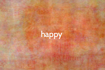 TheColorOf.com is an addictive little website that lets you type in a word and see the color that results. For example, "happy" looks like this.
The image is a composite of 80 separate images from the photo-sharing site Flickr that are tagged with the word you chose.
The site's creator, Singapore-based artist Fung Kwok Pan explains:
Taking the assumption that random images will average out to become grey, we can attribute any colour bias which deviates from grey, to the term as searched.
 Makes sense to me, although my experiments with the site seems to indicate a bias towards warm colors.
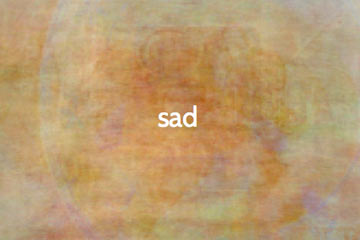
I would expect that "sad" would show a more dramatic difference from "happy" than this. I'm surprised that the images doesn't tend much more towards blue and gray.
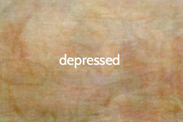 Interestingly, though, a similar word gives nearly the same result.
What's it all mean?
 I'm not sure how much faith to put in the process since the biggest influences of the outcome are 1) the images people have chosen to upload to Flickr, and 2) the words they chose as "tags" or labels.
Seems to me that people would be more likely to upload happy photos than depressing ones.
Still, it's a fun site to play with. Here's one of my favorites. Now it's your turn: