Is this
     the future
          of typography
in the web era?

Make it look
     like poetry.

Sounds good but
     maybe it's not
          that simple.
Last night my Google Alert for "interactive media" picked up an interesting article about Live Ink, a company/technology that claims to dramatically improve peoples' reading comprehension and retention for online material by formatting the text into chunks that "match the eye's physical ability to see with the brain's capacity to comprehend."
Take a look at their 60-second demo to get a better idea of how it works.
The company's research using individuals from 4th grade through college shows significant increases in comprehension and ease of reading. They cautiously attribute the increase to what they describe as "Visual-syntactic formatting" or VSTF. Two key aspects of VSTF are:
- short line lengths (8-30 characters)
- varied indentation patterns forming a cascade of phrases
As a designer with an interest in typography (is that redundant?) I'm always looking for ways to present ideas in a visually understandable and appealing way. Since most of my current work is online, I'm especially interested in how on-screen presentation may differ from print.
I've learned—as have most designers—factors to consider, including line length, leading, font choice, whitespace, and more. Does VSTF make these concepts no longer relevant? I don't think so. There's a lot more involved in reading comprehension and satisfaction than the two VSTF variables.
Studies at Wichita State have shown significant differences based on margins, leading, line length, and other factors. Here are Usability News reports on:
- margins and leading
- Optimal margins and leading help comprehension and satisfaction.
- space between paragraphs
- Whitespace is good, up to a point.
- line length
- No significant effect on comprehension or satisfaction, but surprisingly, long lines (95 characters) made for faster reading.
- multiple vs. single columns
- Slower readers prefer single columns with longer lines, faster readers prefer two narrower columns.
Jakob Nielsen's research into how people read online also should be considered.
- How users read on the web
- They scan for words/phrases of interest rather than reading word for word.
- F-shaped pattern for reading web content
- A couple of horizontal scans across the top followed by a quick vertical scan.
And perhaps most importantly we need to not overemphasize the role of design itself. How the text is presented visually just one thing that affects reading comprehension; there are many other factors.
So what's the point?
I think that the Live Ink/VSTF approach is worth considering. The company seems to have done its homework with a wide range of test subjects (some Wichita State studies were done with a smaller number of college students only). An independent study that replicates the results would be pretty convincing.
The VSTF approach makes sense—it's what editors, typographers and designers have done for years when breaking headlines into "readable" lines. It's also what I just did in editing this article, putting a paragraph break one sentence back, and another here.
Clearly it's similar to what poets have done for centuries. I'm less enthusiastic about how VSTF works with large amounts of text, like a book. I found that reading the sample excerpt from Moby Dick
   clicking from
     page to page
          every few paragraphs
    drove
          me
               crazy.
I can't imagine reading the whole book that way. Because reading is learned with practice, maybe you get used to the fragmented VSTF approach, but at this point the format makes it difficult for me to grasp overall concepts. The company's research seems to indicate otherwise, but it's not working for me.
This is only a test
Fortunately the Live Ink folks have provided a way for us to see how the technology works. You can try it yourself using their Live Ink to Go application.
I thought it would be interesting to see how Lincoln's eloquent Gettysburg Address fared in the Live Ink format. Here's the original from the Project Gutenberg website:
Four score and seven years ago, our fathers brought forth
upon this continent a new nation: conceived in liberty, and
dedicated to the proposition that all men are created equal.Now we are engaged in a great civil war. . .testing whether
that nation, or any nation so conceived and so dedicated. . .
can long endure. We are met on a great battlefield of that war.We have come to dedicate a portion of that field as a final resting place
for those who here gave their lives that this nation might live.
It is altogether fitting and proper that we should do this.But, in a larger sense, we cannot dedicate. . .we cannot consecrate. . .
we cannot hallow this ground. The brave men, living and dead,
who struggled here have consecrated it, far above our poor power
to add or detract. The world will little note, nor long remember,
what we say here, but it can never forget what they did here.It is for us the living, rather, to be dedicated here to the unfinished
work which they who fought here have thus far so nobly advanced.
It is rather for us to be here dedicated to the great task remaining
before us. . .that from these honored dead we take increased devotion
to that cause for which they gave the last full measure of devotion. . .
that we here highly resolve that these dead shall not have died in vain. . .
that this nation, under God, shall have a new birth of freedom. . .
and that government of the people. . .by the people. . .for the people. . .
shall not perish from this earth.
And here's what it looks like using VSTF (white lines indicate "page" breaks):
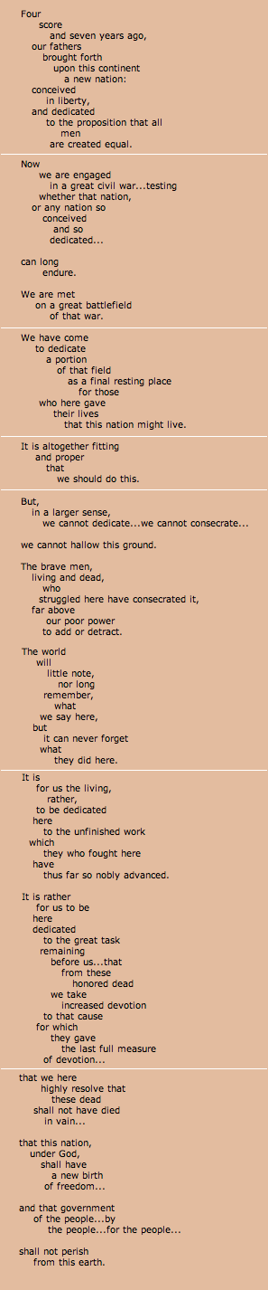
I'm not convinced that this is an improvement.
Does VSTF change the rules of typography? Click on COMMENTS below to share your thoughts.
TOP | | |
ARCHIVE
JULY
- Greek graffiti 7/8/07
- Music at Market 7/7/07
- Self-heating 7/7/07
- Made in China 7/6/07
- Culture in public 7/5/07
- Beach "work" 7/4/07
- Fireworks 7/4/07
- Reality show 7/3/07
- Tech support 7/3/07
- KI to CLE 7/2/07
- Lake view 7/2/07
- Junk mail 7/1/07
JUNE
- Goodbye to KI 6/30/07
- Ferry, sunset 6/29/07
- Limestone quarry 6/28/07
- Stocking up 6/16/07
- Vidopedia, Life 6/15/07
- Progress report 6/15/07
- Etch A Sketch 6/14/07
- David Carson 6/14/07
- Web info 6/13/07
- Tech Support 6/13/07
- Fairview Park 6/13/07
- New computer 2 6/12/07
- Student thanks 6/12/07
- New computer 6/11/07
- Protest 6/10/07
- Sunset 6/10/07
- Olympics logo 6/9/07
- Street life 6/8/07
- Camera damage 6/8/07
- Sunset 6/7/07
- Architecture 6/7/07
- Web info 6/6/07
- Surfing CLE 6/5/07
- Old notes 6/4/07
- Good breakfast 6/3/07
- "Conventional" green 6/3/07
- Nashville Day 3 6/2/07
- Nashville Day 2 6/1/07
MAY
- Nashville Day 1 5/31/07
- Peppers& plans 5/30/07
- Street life? 5/29/07
- Memorials 5/28/07
- Blog or not? 5/28/07
- Breakfast @ Market 5/27/07
- Restaurant scene 5/27/07
- Anne DeChant 5/26/07
- New computer 5/26/07
- Computer woes Pt.2 5/26/07
- Computer woes 5/25/07
- Cleveland sunshine 5/25/07
- Amazon recommends 5/24/07
- Long Tail 5/24/07
- Click! winners 5/22/07
- Honda F1 car 5/21/07
- Human directionals 5/20/07
- Sunday sounds 5/20/7
- Marathon 5/20/07
- Icograda, Havana 5/19/07
- Web + politics 5/18/07
- Design excellence 5/18/07
- Sunset 5/18/07
- Flickrvision 5/17/07
- Tri-C Graduation 5/17/07
- Haircut Day 2007 5/16/07
- Kids' Art Show 5/16/07
- Web articles 5/15/07
- Birds' life 5/14/07
- Chess players 5/13/07
- Portfolio Show 2 5/12/07
- Memory map 5/12/07
- Russian visa 5/11/07
- Portfolio Show 1 5/11/07
- Encyclopedia of Life 5/10/07
- Neighborhood life 5/10/07
- Safe area 5/9/07
- Crile Building 5/9/07
- Passport photo 5/8/07
- Interactive toys 5/8/07
- Long night 5/7/07
- Lilacs 5/7/07
- Forgot to remember 5/6/07
- Cyclist colors 5/6/07
- Spring colors 5/5/07
- Click! judging 5/5/07
- Massage 5/4/07
- Rocky River park 5/4/07
- Beauty & beholder 5/3/07
- Browsercam 5/3/07
- Night game 5/2/07
- Classified website 5/2/07
- Classified video 5/1/07
APRIL
- Student portfolio review
- Dad's birthday
- Red {an orchestra}
- Web 2.0 successes
- Car tattoos
- Great brunch
- TED Talks
- Poor infographic
- Silverlight vs. Flash
- Recycle + exercise
- Better designer tips
- Our Town, CPT
- Audio news
- Old Ford
- Sound of ideas
- Nashville trip
- Dream house
- Soccer in the suburbs
- Hospital story
- Fragments
- Mixed message
- Multiculturalism at Tri-C
- Pretzels
- SEO Pyramid
- Spam, monkeys, Shakespeare
- Sebastien Chevrel
- Spring blossoms
- Towpath Trail
- Designers Toolbox
- Signs of Spring
- Gotta like that
- Map mashup
- Design Can Change
- Grass cutting
- Halloumi cheese
- First sunbathers
- Truck colors