Different approach
 A colorful Cleveland skyline still seems to be the sentimental favorite in our class search for a visual identity for this year's Portfolio Show, but a new contender emerged today.
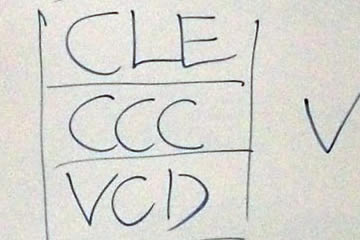
We'd just finished a lively round of brainstorming, trying to come up with words to use as a headline and/or tagline when this combination came up.
Short and to the point. Maybe a keeper.