APRIL 9, 2010
Worst fare machine, revisited
Last October I tried buying a ticket at one of RTA's automated fare machines. It was so frustrating that I wrote an article calling it "The World's Worst Fare Machine." I'm not alone. A Cleveland.com article on RTA customer service issues drew comments like this:
"...RTA...just spent millions on fare machines that inexplicably sell only two passes (single ride and all day) and default to senior/disabled rather than general."
"The new fare system is a joke. Most inefficient user interface I've ever seen."
"...those new pass/ticket machines are confusing as someone has previously posted..."
from Cleveland.com
 Oh, that's better
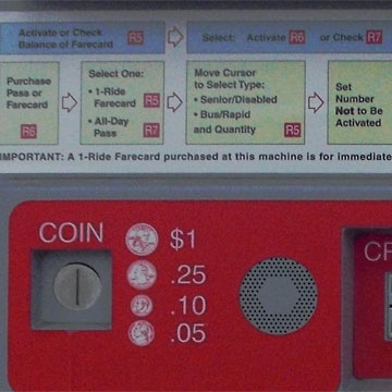
Responding to complaints, RTA has added instructions. See how simple it is? Aren't you ashamed that you couldn't figure it out yourself?
I especially like the step at far right: after you've selected Pass or Farecard, then Senior/Disabled or Bus/Rapid, then you Set Number NOT to Be Activated.
What could be easier?
Although I'm making fun of this situation, it's really pathetic that Cleveland's transit agency has spent hundreds of thousands (?) of dollars on these user-hostile machines.
We deserve better.
Transit systems all over the world have done better. I'm convinced that my Media Design students, after only twelve weeks of class, could do better. Maybe I should challenge RTA to a design competition.
Top |
|
![]()
