DECEMBER 18, 2009
Finished
Finally done with grading for the semester. Today I get to think about other things, like how to avoid this last-minute crush by scheduling earlier due dates for final projects. Another idea I may try is to guarantee students written feedback in two weeks or less. This is of course a ploy to keep me on schedule, but should also make clear to them that feedback is important.
But that's for another day. Today I want to share with you a few of the more successful projects from the Monday/Wednesday Web Publishing I class. Each of them includes elements that make them "webby"—in other words, they do things unique to the web that can't be done in print.
As is true for most of our Web Publishing I students, this was their first foray into web design.
Favorite artist/designers
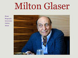
 Roberto included video interviews with the dean of American graphic design, Milton Glaser, to give you a sense of the man as well as his work.
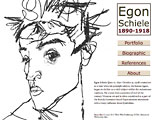
 Bruce focused on the drawings of Egon Schiele rather than his more popular paintings. The site's secondary pages use a novel center navigation bar instead of the typical top or left navigation.
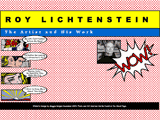
 Maggie's Roy Lichtenstein site shows his Pop Art and talks about how he did it. It also includes a link to a tutorial that teaches you how to do something similar with your own photos.
More
If you missed it earlier, the Thursday class chose "food" as the topic for their websites.
[ What the Thursday class did ]
Top |
|
![]()
