Big & beautiful
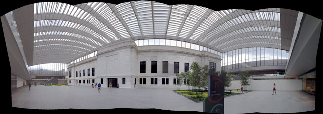
 The Cleveland Museum of Art opened its long-awaited atrium this week, so we hopped up there on Sunday to see it. While it looks empty in the panorama above, it actually feels very lively as people walk across to enter the 1916 building (center).
I remember hearing architect Rafael Vinoly many years ago explain that he saw the 1916 building as a jewel which would be encased by the new addition he designed. When you see the entire north wall of the old building inside this huge glass display case, you get his vision.
I've been worried that the atrium would be too big, overwhelming instead of welcoming. It didn't feel that way when we visited even though the space isn't fully completed and in use yet. Plain Dealer writer Steven Litt explains how the atrium will be the "heart of the institution." So far, I'm optimistic that it is going to work.
Another look
 While we were there I decided to compare the results from Microsoft's free Photosyth app for the iPhone, which I've talked about before, with a highly-praised competitor, 360 Panorama.
You use both apps in pretty much the same way. Launch the app, tap to start, and slowly turn, letting the app take pictures when it decides to. Photosynth uses a green box to show when it takes a shot, which I think is helpful.
The results

 At first glance the panoramas look similar, but there are significant differences.
In reviews, 360 is often praised for how seamlessly it stitches images together, but my results were very different.
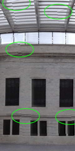
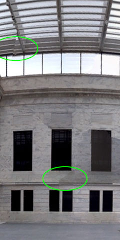
Compare these two slices to see what I mean.
At near right, Photosynth shows a couple of geometric oddities.
At far right, 360 has more, and more visible, disjointed seams.
So for now at least, Photosynth will be my go-to panorama app.