Still the worst
I was pleased to see an article in the Plain Dealer yesterday describing the truly awful fare machines that the RTA is still using despite overwhelming rider dissatisfaction. I've talked about the problems in 2009 (World's Worst Fare Machine) and 2010 (World's Worst Fare Machine, Revisited).
 Before doing it again, I thought I'd check to see if in two years RTA had made any improvements. You'd hope. So I went to the Ohio City Rapid station and immediately found someone standing in front of the machine, clearly frustrated. She asked if I could help her buy an all-day pass. Several minutes later, mission accomplished.
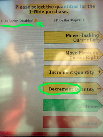
Sadly, this confirmed my suspicion that RTA had not improved the machines since my 2010 article. Nearly every step is complex and confusing, but the screen you see at right may be worst of all.
On the previous screen I'd just selected "Purchase One-Ride Farecard". Stupidly, this next screen shows the "quantity" as "0". And probably unwisely for most, it defaults to "Senior/Disabled".
Notice, too, that the quantity (the item you're now setting) is the smallest type on the entire screen.
If you're paying close attention (and are neither Senior nor Disabled) you need to press "Move Flashing Cursor Right", then "Increment Quantity". "Increment"? "Decrement"? Who talks like that? I'll bet the typical English speaking person has never used these words in his/her life.
But I'm beating a dead horse here, so I'll just let it go for now and wait until the "improved" fare machines are unveiled next month. Should be interesting.