Storytelling, the Pixar way
With its string of successful films, no one can doubt that folks at Pixar know a thing or two about storytelling. Storyboard artist Emma Coats shared 22 of their "secrets" via her Twitter account. These have been reprinted and remixed in a variety of forms.
The rules are definitely worth reading. My question is, what's the best format to present them? In other words, how to best tell the story of the 22 rules of storytelling?
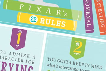
 Huffington Post favors this "lovely infographic" from PBJpublishing.
I don't. The cute and colorful illustration style makes it harder to read and understand the rules. Not helpful.
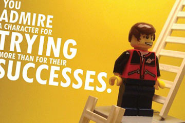
The LEGO version from Icanlegothat is too cute for my taste, but the type is nicely done. More clear and direct than the previous version.
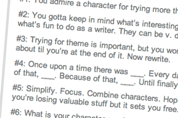
 The Pixar Touch blog is about as basic as you can get.
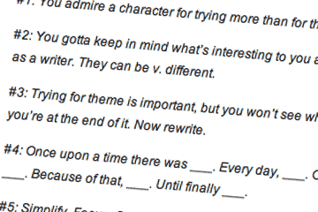
 And finally, here's what the rules look like on Emily Coats' own blog, Story Shots.
None of the above
I'd say that none of the four versions do a great job of telling this particular story. The illustrated ones are too distracting, the typographic ones too stark. Typefaces have personality; good typography expresses and clarifies meaning. The typography here isn't saying much at all.
What do you think? Which of these communicates best to you?
