Ideas
 After five years of the current look & feel, I'm working on a complete redesign for The View From 32 (Vf32). Read about new features by checking this earlier article.
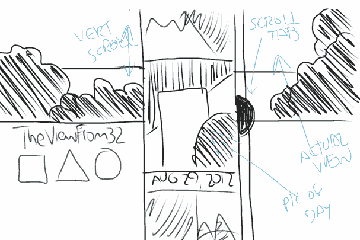
The homepage will look totally different, but I'm still playing around with ideas. Read more below, or go right to the sketches. Your comments will help make a better Vf32.
[ Skip the explanation, show me more sketches ]
Calendar?
Currently it's organized sort of like a calendar, month by month. Unlike a typical calendar, the weeks run together in a long horizontal strip. This may change. Maybe it should look more like a traditional grid. Maybe it should be a single vertical strip. Or since "weeks" and "months" are somewhat arbitrary divisions of time, it might be better to highlight, say, five days at a time rather than a week or a month.
Color?
Since I'm fascinated by weather data, I'll still use color to show temperature. Somehow. A big improvement I hope to add is to pull the current weather data from the National Weather Service, so that the home page color will show the temperature right now rather than the average temperature for the month. I'm hoping to also show current conditions (clear, cloudy, rain, etc.).
Content?
A real weakness of the current site is that it doesn't give you a good idea of related information published earlier.
You can do a search for any topic on the home page, but that's an extra step. I'd like to make all content much more visible.
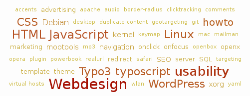
 The WordPress content management system will make this easy via "tags" and a "tag cloud."
When I write each article I'll give it several tags. For today they might be: "website" "design" "color" "View From 32", etc.
The tag cloud shows you all the possibilities. Larger size means more articles on that topic. Above, for example, there are a lot of article tagged "usability." To read them you'll simply click on the word to see them grouped together.
View
The banner image at the top of this page and the home page is a view of Lake Erie from West 32nd Street. I change them occasionally to reflect the many moods of the lake, but I don't do it nearly enough. The new homepage will show a view from 32, but I hope to set up a webcam on my room so that it is the current view, in the same way that I want the weather color to show the current weather.
This will probably be the most technically challenging addition, so may take a while to get going. In the meantime a plain old photo, similar to what I've been using, will have to suffice.
Take a look, give me you opinion
Right now I'm at the sketching stage with homepage designs. I need your honest feedback. I will greatly appreciate any and all comments on these early ideas. You can see a batch of them over on my WordPress site. Please comment there, not here.
I'm trying to think of something I can give you as a thank you gift for taking the time to do this. No idea yet, but I'm open to suggestions about that too! In the meantime, thank you, thank you, thank you.
Click to take a look at homepage sketches