Monday night out
A great thing about Monday nights is that all the Cleveland Cinemas theaters have $5 admission plus a free bag of popcorn. Hard to beat that deal, so we try to take in as many Monday night movies as possible. Tonight, though, we did something different.
I'd seen a listing for a comedy show, the Chucklef*ck Comedy Night at Bela Dubby, a pleasant little coffeeshop/gallery/bar in Lakewood. What caught my eye was the name of the master of ceremonies, Jim Tews. Jim is a recent Tri-C grad who'd been in my Portfolio Preparation class a little more than a year ago. Thought it would be fun to see him in a different role/environment.
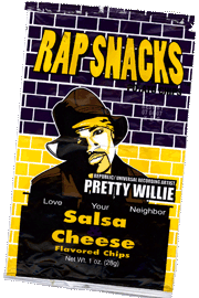
 We got there a little after 8 and the place was pretty full. We took a seat on the funky old sectional sofa near the door, giving us a good view of the "stage" plus everyone coming and going. We got a couple of drinks, a bag of Rap Snack chips and settled in to enjoy the show.
Jim did an introduction to what seemed to be a sort of open mic night, with a half-dozen comedians (all but one male) doing 5-10 minute sets. The last act was a longer and more polished production than the others.
It turned out to be fun. Some of the comics were better than others, some more polished, some more nervous. No one was painfully unfunny, and the audience was pretty supportive. Because each performance was only a few minutes long, we got to hear/see a wide variety of styles.
One of my favorites was an extended riff on signs that use icons instead of words. You know the ones: stick men, question marks, the letter P with a line through it. Since thinking about symbols and meaning is what I do much of the time, poking fun at them works for me.
So the Chucklef*ck Comedy Night was a nice change of pace for Monday night. We'll be back.
TOP | | |
PoMo Lite
I made it through four and a half years of undergraduate education, twenty years in the design industry, and two years of good ol' midwestern grad school education in design (Kent State) without ever hearing the words "design" and "theory" in the same sentence.
Then I taught at Herron School of Art for three years and hung out with the newer faculty who'd gone to schools like Cranbrook, CalArts, and RISD. They talked about "deconstruction," "discourse," "semiotics" and Post-Modernism. I proudly proclaimed my total ignorance of design theory (no exaggeration, sad to say) and that was that. When I tried to read the essays they'd assign students, they all seemed something like this one: (click to read and be sure to read the note at the bottom).
 Still, obscure as the actual writings were to me, there were always little bits of information that seemed to make sense, particularly ideas of how things acquire meaning (or not) based on who sees them and where. Since my Herron years I've had an urge (not all that strong most of the time) to learn exactly what "Postmodernism" is. And those of you who know something about it realize that the question isn't a very postmodern question.
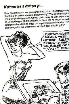
Anyway, some years back I bought Introducing Postmodernism by Richard Appignanesi and Chris Garratt. I thought that its "graphic study guide" approach (think Cliff Notes with cartoons, shown at right) would make the material more understandable.
Didn't work for me. But there still may be hope.
Last week at the Lakewood Library I picked up an equally thin book (230 pages), Teach Yourself Postmodernism by Glenn Ward. It looked both clear and approachable. I've been reading it for the past few days, one chapter at a time, and I hope in a couple more days to be able to write my own outline of postmodernism and how it relates to design. Stay tuned for more.
TOP | | |
ARCHIVE
AUGUST
- Late assignments 8/19/07
- Summer's end 8/18/07
- NetRenderer 8/17/07
- History map 8/16/07
- Walking 8/15/07
- Tech training 814/07
- Home & away 8/13/07
- Family day 8/11/07
- County fair 8/10/07
JULY
- Warning 7/27/07
- Akron museum 7/26/07
- Sound recording 7/25/07
- New camera 7/24/07
- Sicko 7/23/07
- Second looks 7/22/07
- Spectropia 7/22/07
- Found in Crowd 7/21/07
- Grandmaster Flash 7/21/07
- Ingenuity Day 2 7/20/07
- Troika Ranch 7/19/07
- Ingenuity drums 7/19/07
- Sandy beach 7/18/07
- Buying rubles 7/18/07
- Brutal to bland 7/17/07
- d.a. levy 7/16/07
- Save gas 7/15/07
- Clouds, music 7/14/07
- Colored shadows 7/13/07
- Neighborhood 7/12/07
- Surfers 7/11/07
- Ratatouille 7/10/07
- Online typography 7/9/07
- Greek graffiti 7/8/07
- Music at Market 7/7/07
- Self-heating 7/7/07
- Made in China 7/6/07
- Culture in public 7/5/07
- Beach "work" 7/4/07
- Fireworks 7/4/07
- Reality show 7/3/07
- Tech support 7/3/07
- KI to CLE 7/2/07
- Lake view 7/2/07
- Junk mail 7/1/07
JUNE
- Goodbye to KI 6/30/07
- Ferry, sunset 6/29/07
- Limestone quarry 6/28/07
- Stocking up 6/16/07
- Vidopedia, Life 6/15/07
- Progress report 6/15/07
- Etch A Sketch 6/14/07
- David Carson 6/14/07
- Web info 6/13/07
- Tech Support 6/13/07
- Fairview Park 6/13/07
- New computer 2 6/12/07
- Student thanks 6/12/07
- New computer 6/11/07
- Protest 6/10/07
- Sunset 6/10/07
- Olympics logo 6/9/07
- Street life 6/8/07
- Camera damage 6/8/07
- Sunset 6/7/07
- Architecture 6/7/07
- Web info 6/6/07
- Surfing CLE 6/5/07
- Old notes 6/4/07
- Good breakfast 6/3/07
- "Conventional" green 6/3/07
- Nashville Day 3 6/2/07
- Nashville Day 2 6/1/07
MAY
- Nashville Day 1 5/31/07
- Peppers & plans 5/30/07
- Street life? 5/29/07
- Memorials 5/28/07
- Blog or not? 5/28/07
- Breakfast @ Market 5/27/07
- Restaurant scene 5/27/07
- Anne DeChant 5/26/07
- New computer 5/26/07
- Computer woes Pt.2 5/26/07
- Computer woes 5/25/07
- Cleveland sunshine 5/25/07
- Amazon recommends 5/24/07
- Long Tail 5/24/07
- Click! winners 5/22/07
- Honda F1 car 5/21/07
- Human directionals 5/20/07
- Sunday sounds 5/20/7
- Marathon 5/20/07
- Icograda, Havana 5/19/07
- Web + politics 5/18/07
- Design excellence 5/18/07
- Sunset 5/18/07
- Flickrvision 5/17/07
- Tri-C Graduation 5/17/07
- Haircut Day 2007 5/16/07
- Kids' Art Show 5/16/07
- Web articles 5/15/07
- Birds' life 5/14/07
- Chess players 5/13/07
- Portfolio Show 2 5/12/07
- Memory map 5/12/07
- Russian visa 5/11/07
- Portfolio Show 1 5/11/07
- Encyclopedia of Life 5/10/07
- Neighborhood life 5/10/07
- Safe area 5/9/07
- Crile Building 5/9/07
- Passport photo 5/8/07
- Interactive toys 5/8/07
- Long night 5/7/07
- Lilacs 5/7/07
- Forgot to remember 5/6/07
- Cyclist colors 5/6/07
- Spring colors 5/5/07
- Click! judging 5/5/07
- Massage 5/4/07
- Rocky River park 5/4/07
- Beauty & beholder 5/3/07
- Browsercam 5/3/07
- Night game 5/2/07
- Classified website 5/2/07
- Classified video 5/1/07
APRIL
- Student portfolio review
- Dad's birthday
- Red {an orchestra}
- Web 2.0 successes
- Car tattoos
- Great brunch
- TED Talks
- Poor infographic
- Silverlight vs. Flash
- Recycle + exercise
- Better designer tips
- Our Town, CPT
- Audio news
- Old Ford
- Sound of ideas
- Nashville trip
- Dream house
- Soccer in the suburbs
- Hospital story
- Fragments
- Mixed message
- Multiculturalism at Tri-C
- Pretzels
- SEO Pyramid
- Spam, monkeys, Shakespeare
- Sebastien Chevrel
- Spring blossoms
- Towpath Trail
- Designers Toolbox
- Signs of Spring
- Gotta like that
- Map mashup
- Design Can Change
- Grass cutting
- Halloumi cheese
- First sunbathers
- Truck colors