AUGUST 18, 2010 More: VACATION UPDATE
Back to school
For the first time in three months I was back in my office at Cuyahoga Community College. I have to admit that my pace slowed as I first walked toward the building. I wasn't totally prepared to officially get back into my school/work mode. But once inside things improved. I cleaned out my email Inbox, sorted through a stack of papers I left on the desk back in May, and chatted with a few colleagues I saw in the hallways. Not a bad first day back.
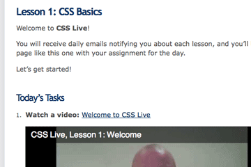
 My other back-to-school experience was doing Lesson 1 in the SitePoint CSS Live online class.
I've found the SitePoint website, books and tutorials to be pretty helpful—generally clear, accurate, and to the point—so thought it would be useful to see how they presented basic CSS (Cascading Style Sheets, an important part of the code that makes websites).
I have three goals in taking this class:
- see how they present the material: sequence, quantity and depth of information
- see the kinds of exercises, quizzes, etc. they use to reinforce the presentation
- brush up on my own understanding of CSS
Since I teach CSS as part of my Web Publishing I class, I'm hoping to improve my own presentation. I've also found that it's very helpful to be a student and see things from that perspective. As a teacher it's all too easy to forget how things look from the other side of the desk (or computer).
I've watched the videos and made my way through the associated material for Lessons 1 and 2. So far I'd say that the what to do is explained pretty well, but the why do it leaves a bit to be desired. I was particularly disappointed that after showing how to change the color of a link (this is a link) to purple, no mention was made that the web convention is that unclicked links are blue while clicked-on (visited) links are purple. This is a significant bit of built-in usability design that we ignore at our own risk. I'm constantly reminding students that just because you can change the color of links doesn't mean that you should.
Otherwise, so far, so good. Always interesting and useful to see someone else's view.
Vacation update
 Just added:
Driving tour of Dingle Peninsula; Baffling road sign; Chili dog; Card games
— July 30, 2010
