JUNE 10, 2010
Emotional words
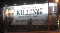
 You may have seen this billboard on Carnegie at East 9th in downtown Cleveland. It makes an emotional plea in favor of passing a piece of legislation called The American Power Act, sponsored by Senators Joe Lieberman and John Kerry.
Without getting into the merits of the bill itself, what do you think of the billboard?
It has a number of design flaws, in my opinion, that make for a confusing message. In particular I question the choice of a messy-looking typeface for the main headline: Iran makes a killing every day we wait. I understand the motivation: the typeface is supposed to communicate emotion, perhaps violence, perhaps blood spilled over oil.
If you go the the website shown on the billboard, PassTheAmericanPowerAct.com you'll see that their campaign is based on the idea that the U.S. needs to reduce our dependence on oil to save lives (of soldiers who must fight to protect oil interests). Whether this approach makes sense is a discussion for another day. Right now I'd like to focus on the typography on the billboard itself.
The "grunge" typeface was used to strengthen the impact of the words, but I don't think it's working. Mouseover the image below to see a typographic alternative.
Which do you prefer, and why? Is the "more expressive" font more expressive?
Click on "Leave a comment/read comments" below to share your opinion.
